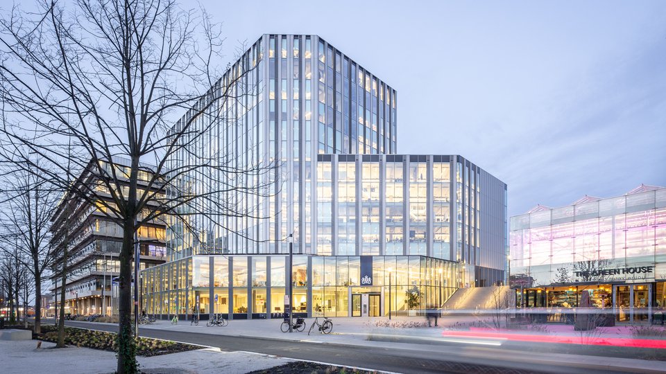
| Client | Houthoff Rotterdam |
| Square | 5.000 |
| Program | Office environment |
| Project Management | STONE Projectmanagement |
| Timeline | April 2018 – May 2021 |
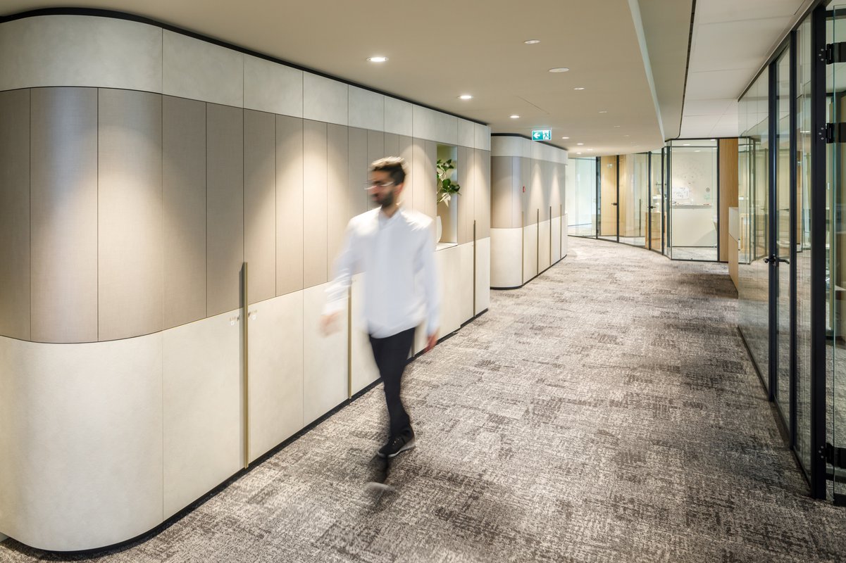
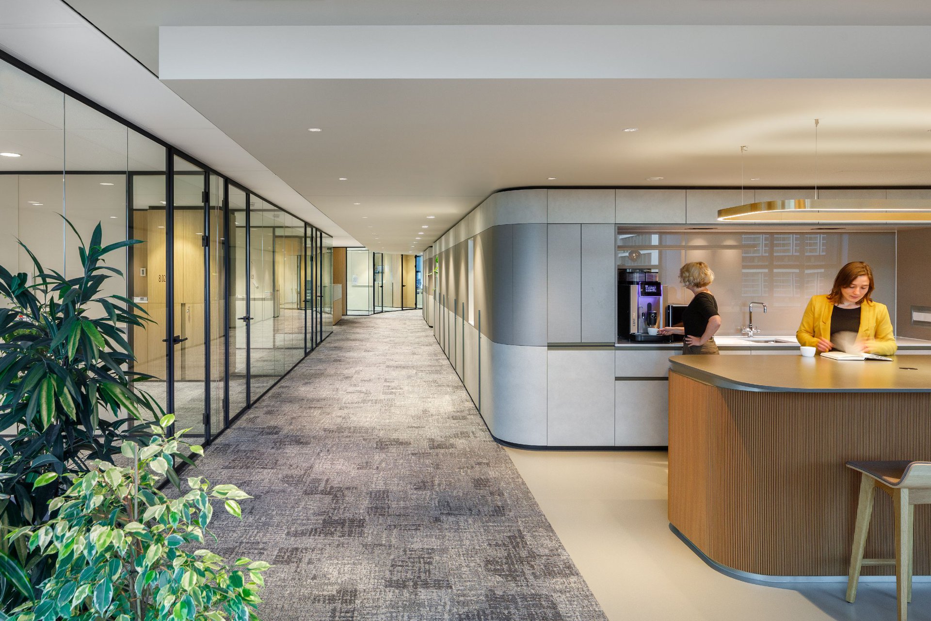
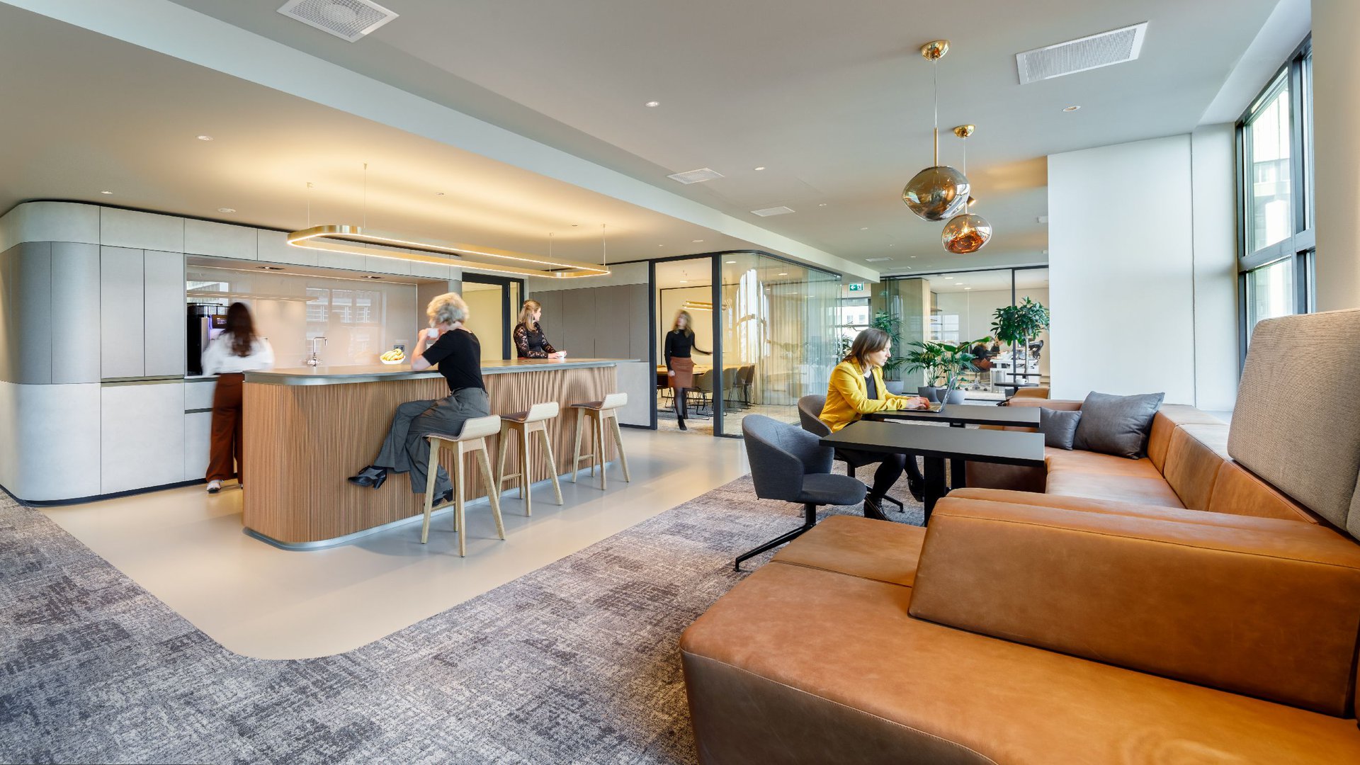
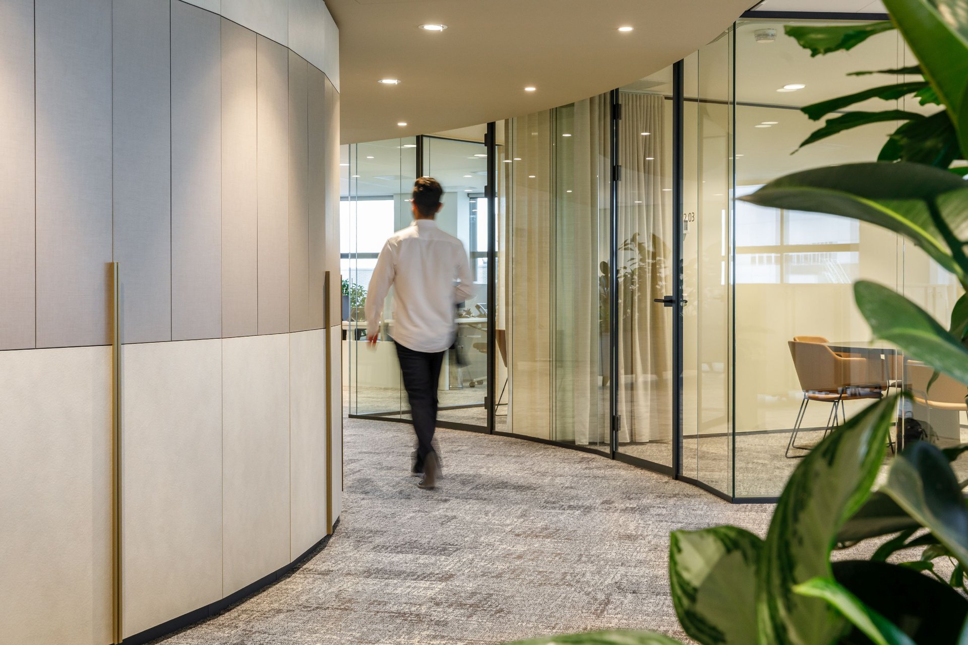
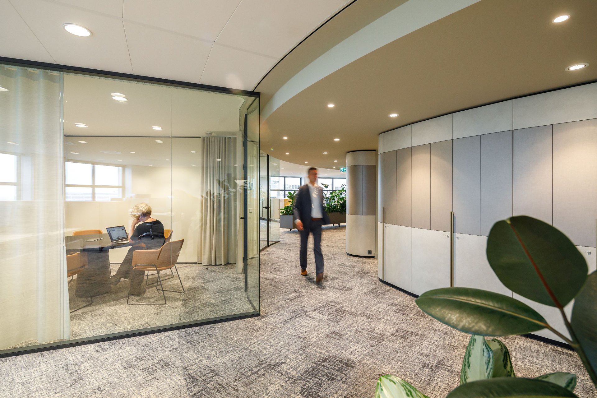
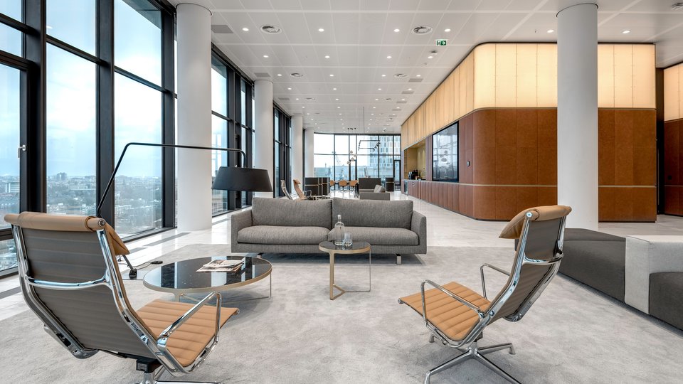
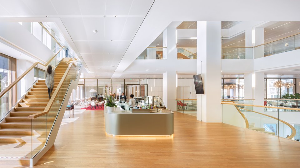
The interior design for Houthoff is based on the sightlines along the central core, consistently pursuing the rounded shape of the building. This guiding principle is emphasized by the materialisation of the integrated cabinets and separations. Each floor is accessed at its heart, an open, communicative space which features a pantry, touchdown meeting places and a conference room.
Parallel lines
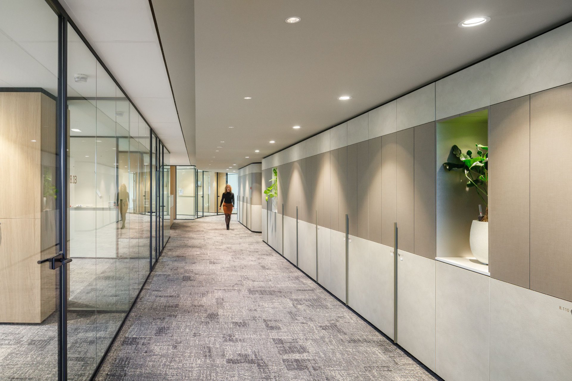
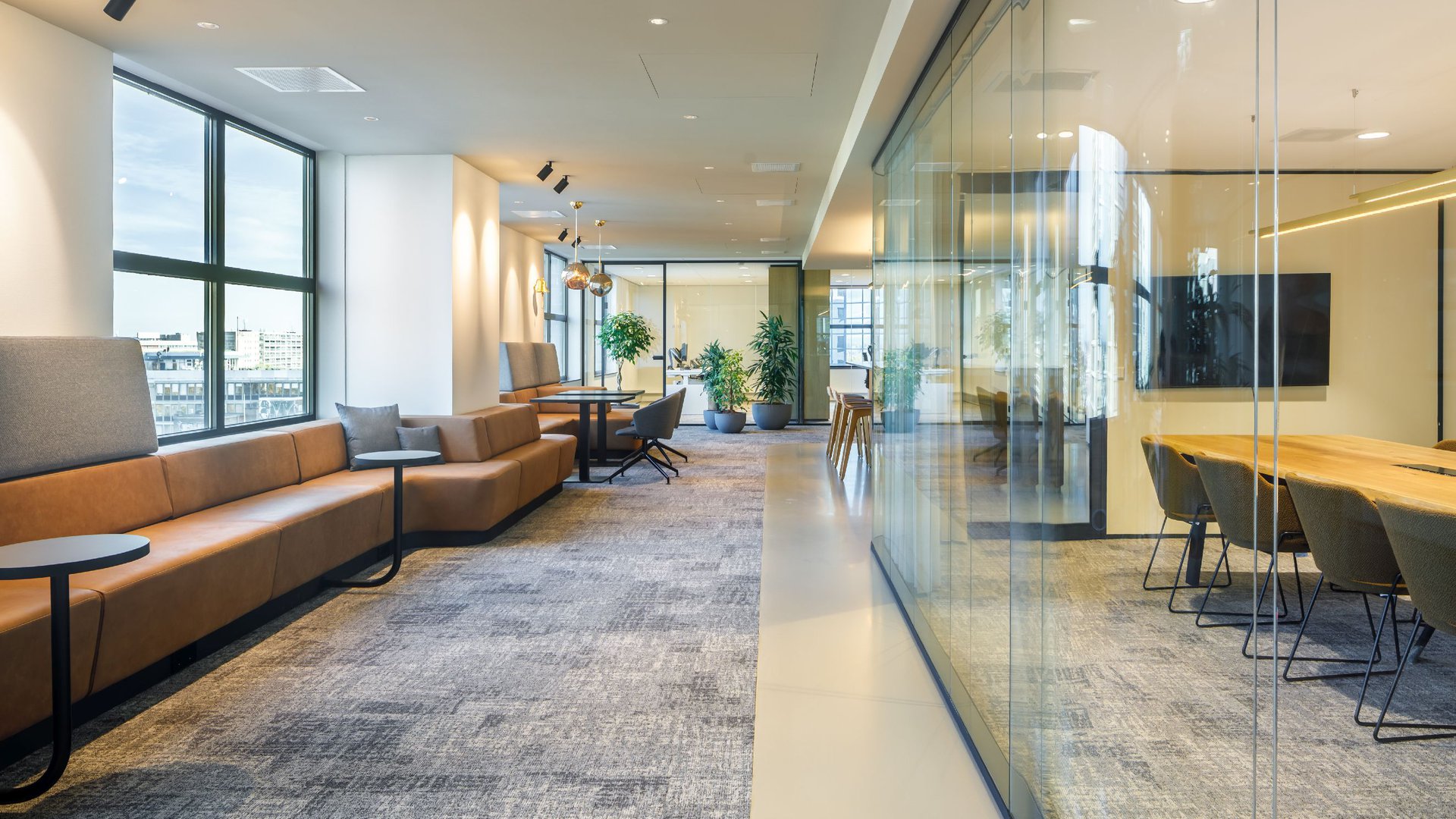
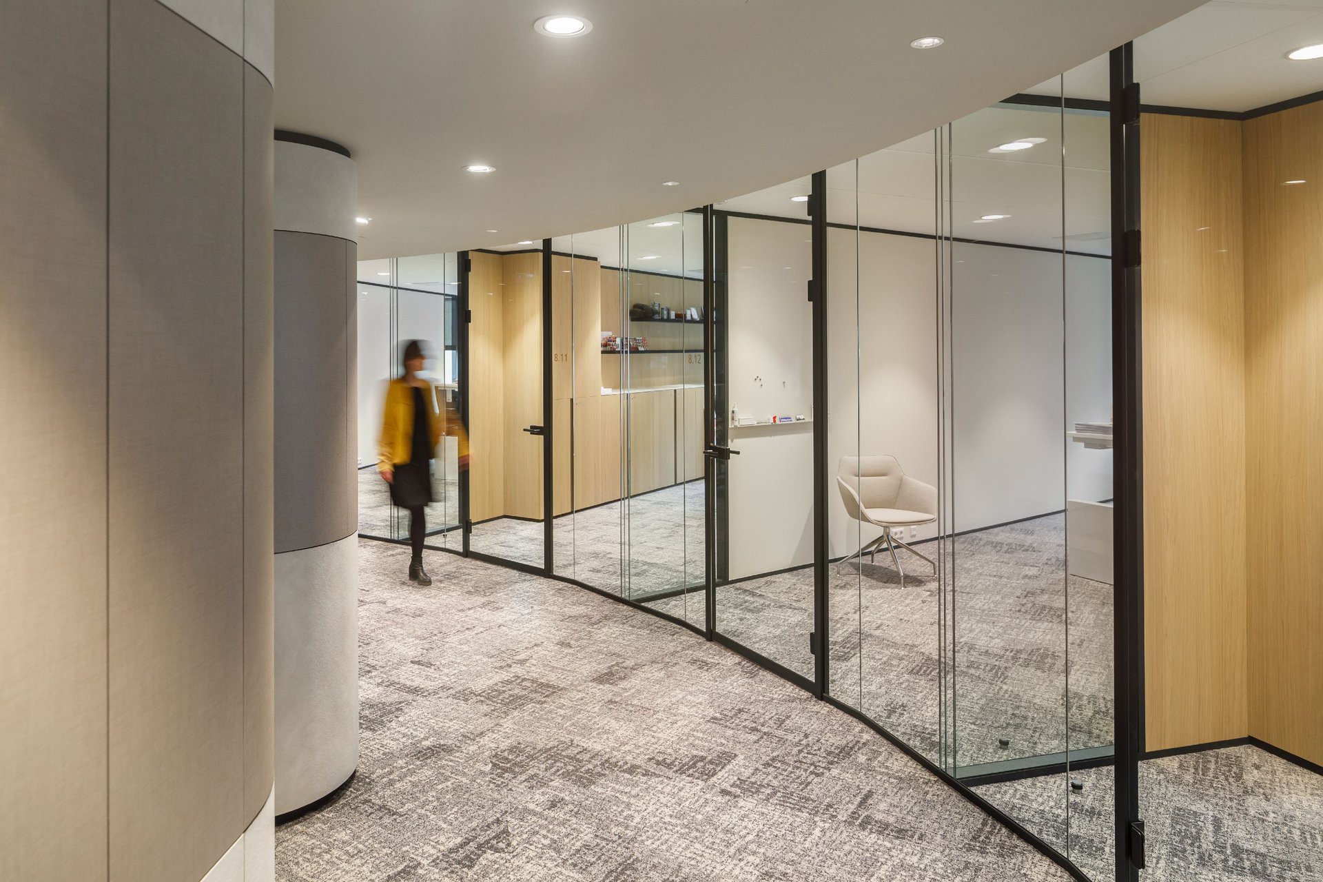
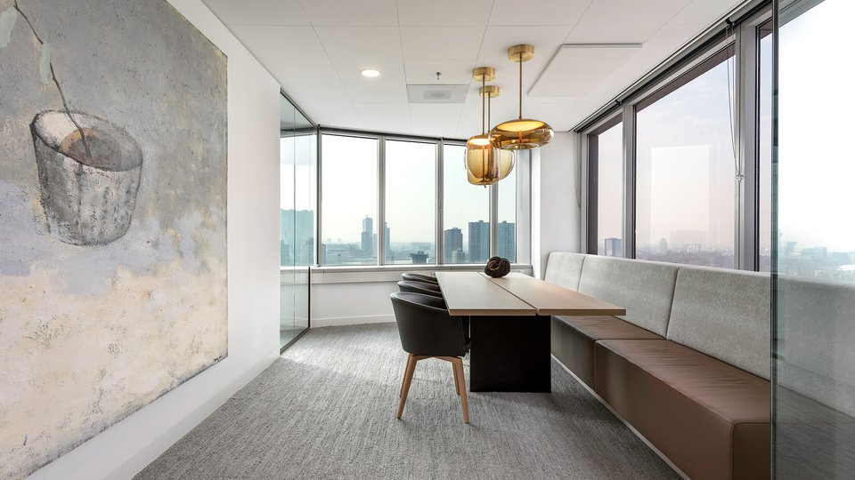
The cabinets separating the private offices are placed perpendicular to a distinctive transition of colour in the floor, on an offset running parallel with the building core. Precisely on the separation of the floor transition, the cabinets give way to a transparent wall. This system provides sufficient seclusion to guarantee the confidential work processes and concentration of the employees, but also contributes to the open and transparent character of the rest of the floor. By allowing the lines in the ceiling to follow a different parallel, the design results warmer and more intimate. The gradual spatial transitions are enriched with curtains in the conference rooms and large planters at the open office zones.
Sightlines along the central core, consistently pursue the rounded shape of the building.
A natural palette
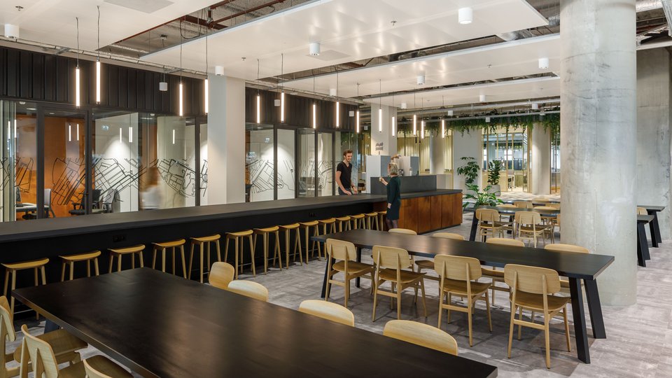
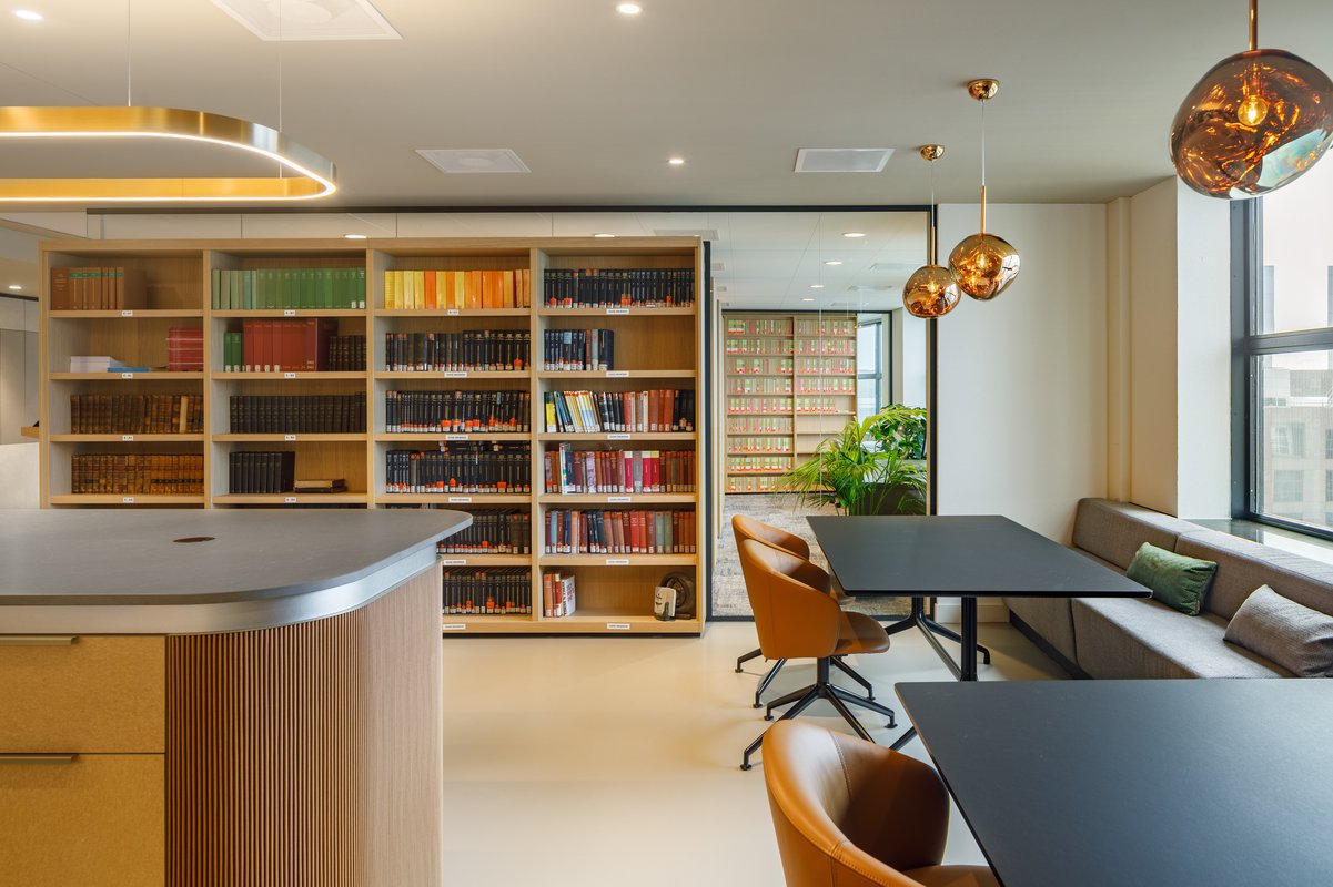
The central core is surrounded by cabinets in which a subtle transition of materials defines the base of the colour scheme. Refined transitions in the interior finishes are supported with neutral colour tones and dark profiles. The high room dividing cabinets and the materialisation of the social square are characterised by wood and warm bronze tones. The materials chosen have subtle differences in structures that provide the design with an elegant touch, where the smallest details are considered.
Photography: Bram Vreugdenhil
