| Client | Houthoff |
| Location | Amsterdam |
| Square | 12.500 |
| Timeline | April 2014 - July 2024 |
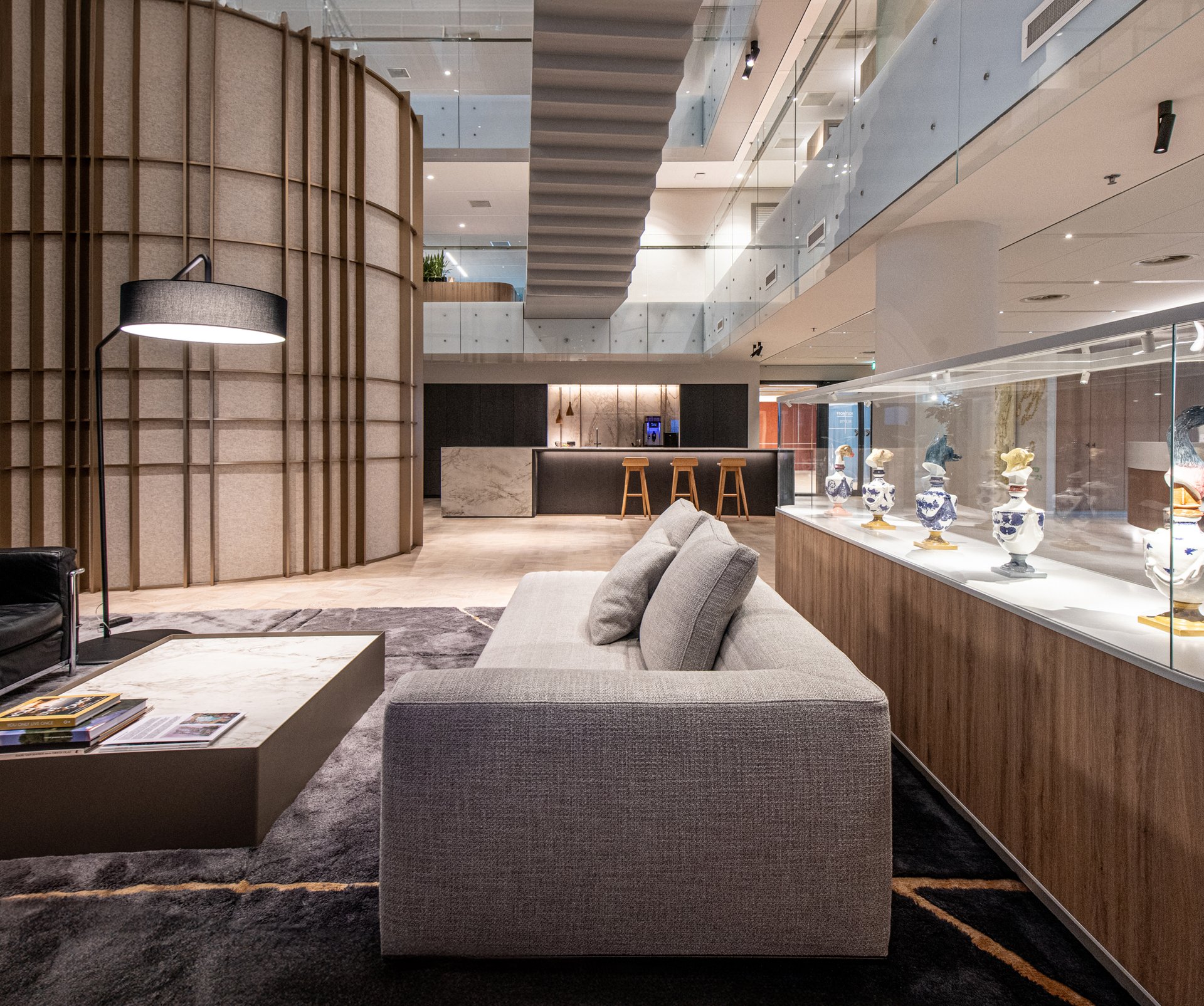
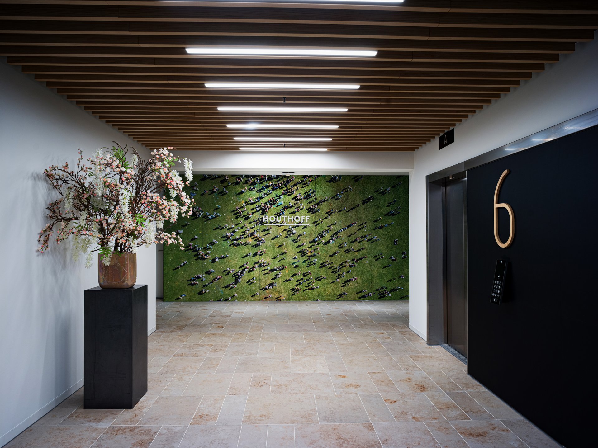
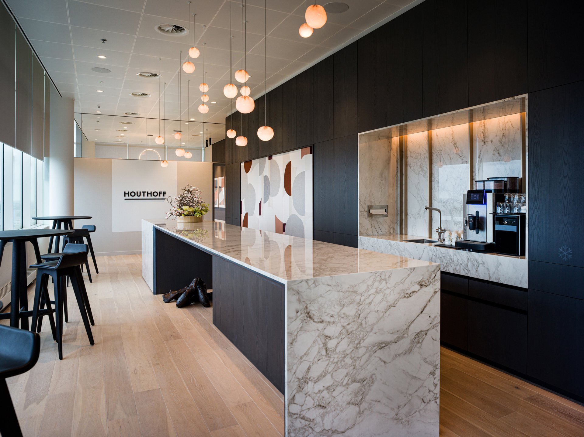
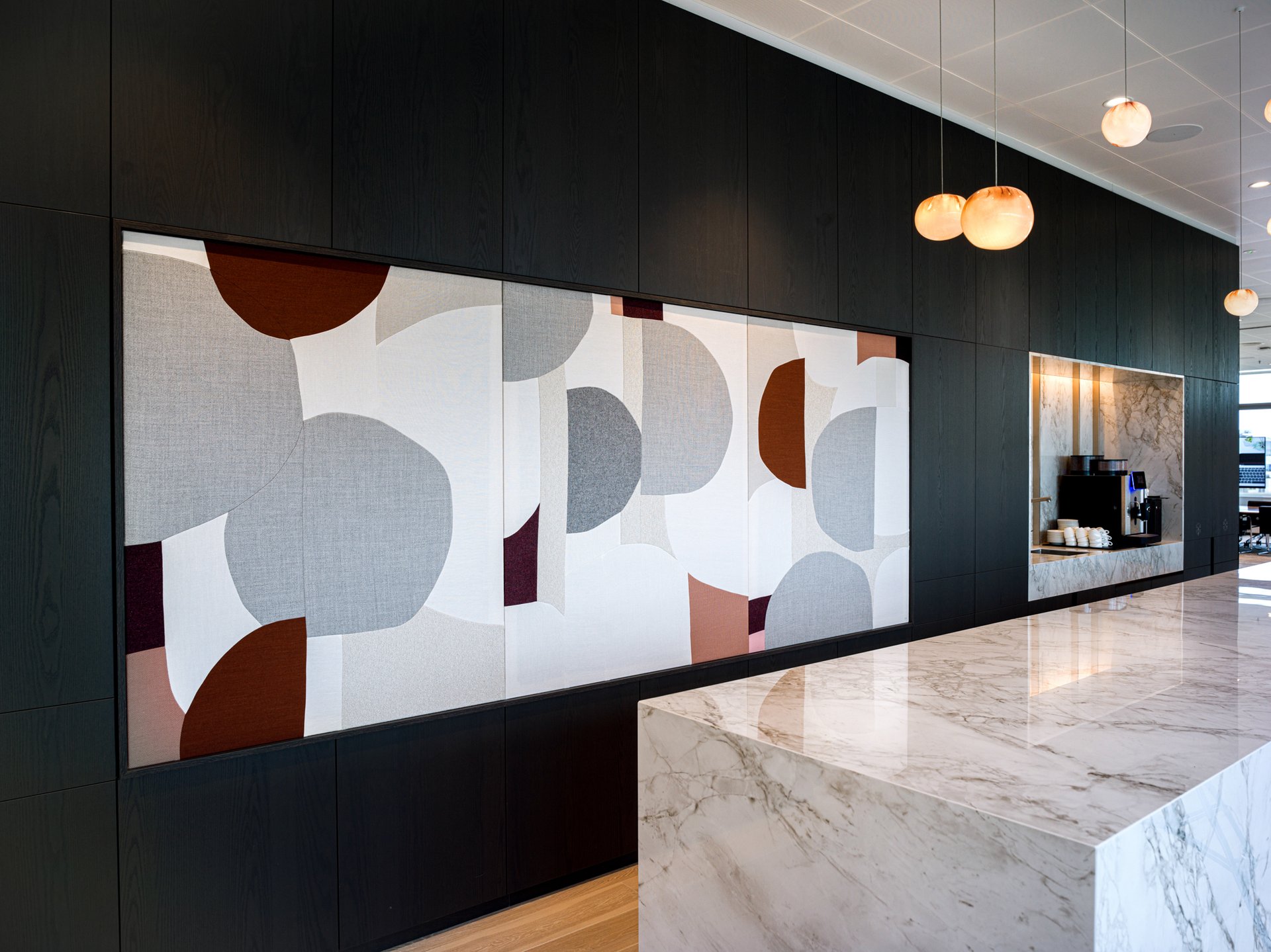
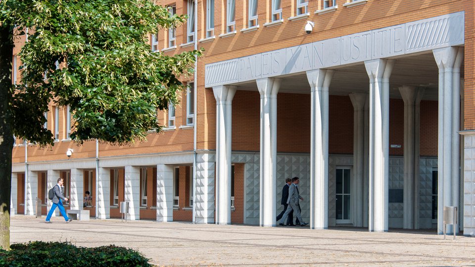
Following the renovation of Houthoff Rotterdam, the office in the Amsterdam business district Zuidas has now been transformed. While preserving the DNA of the design in Rotterdam which is best reflected in the clear sightlines, the strict composition of spaces, and the use of natural, serene colours. For the Amsterdam office, we’ve added another layer by integrating Houthoff's extensive art collection and a focus on creating community spaces unique for each floor.
How to make a sizable office personal?
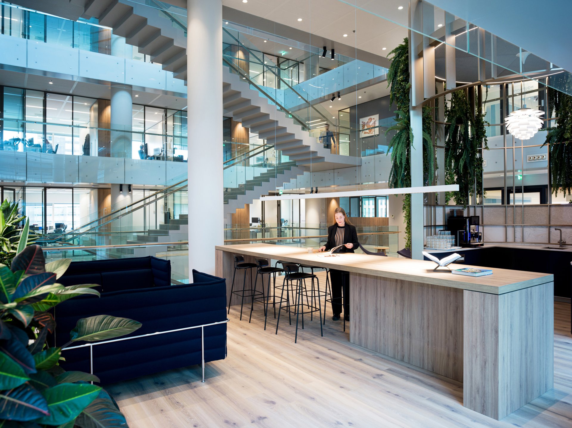
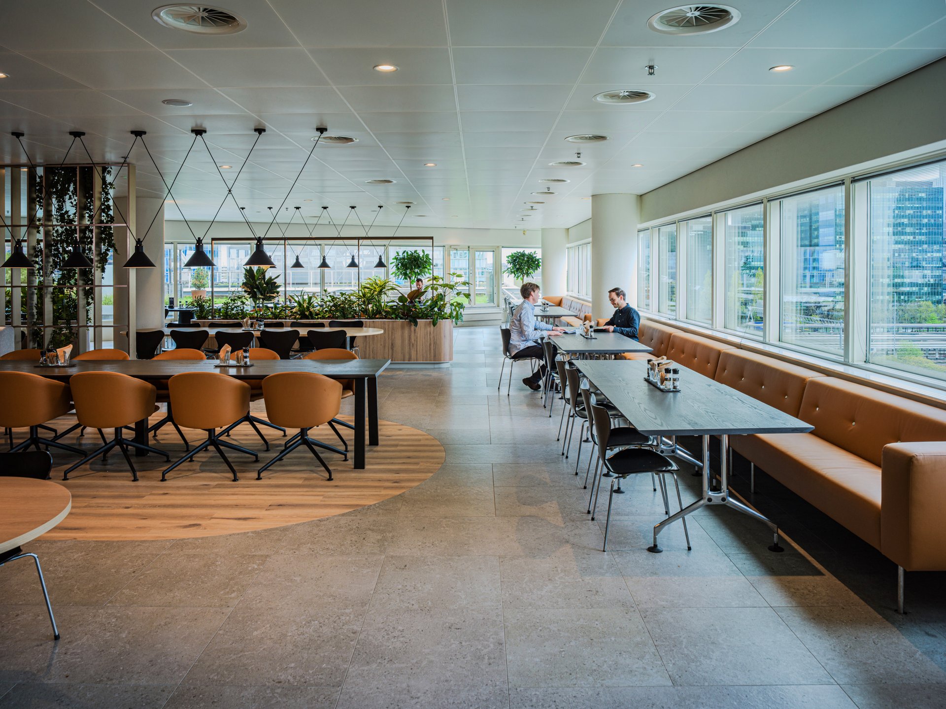
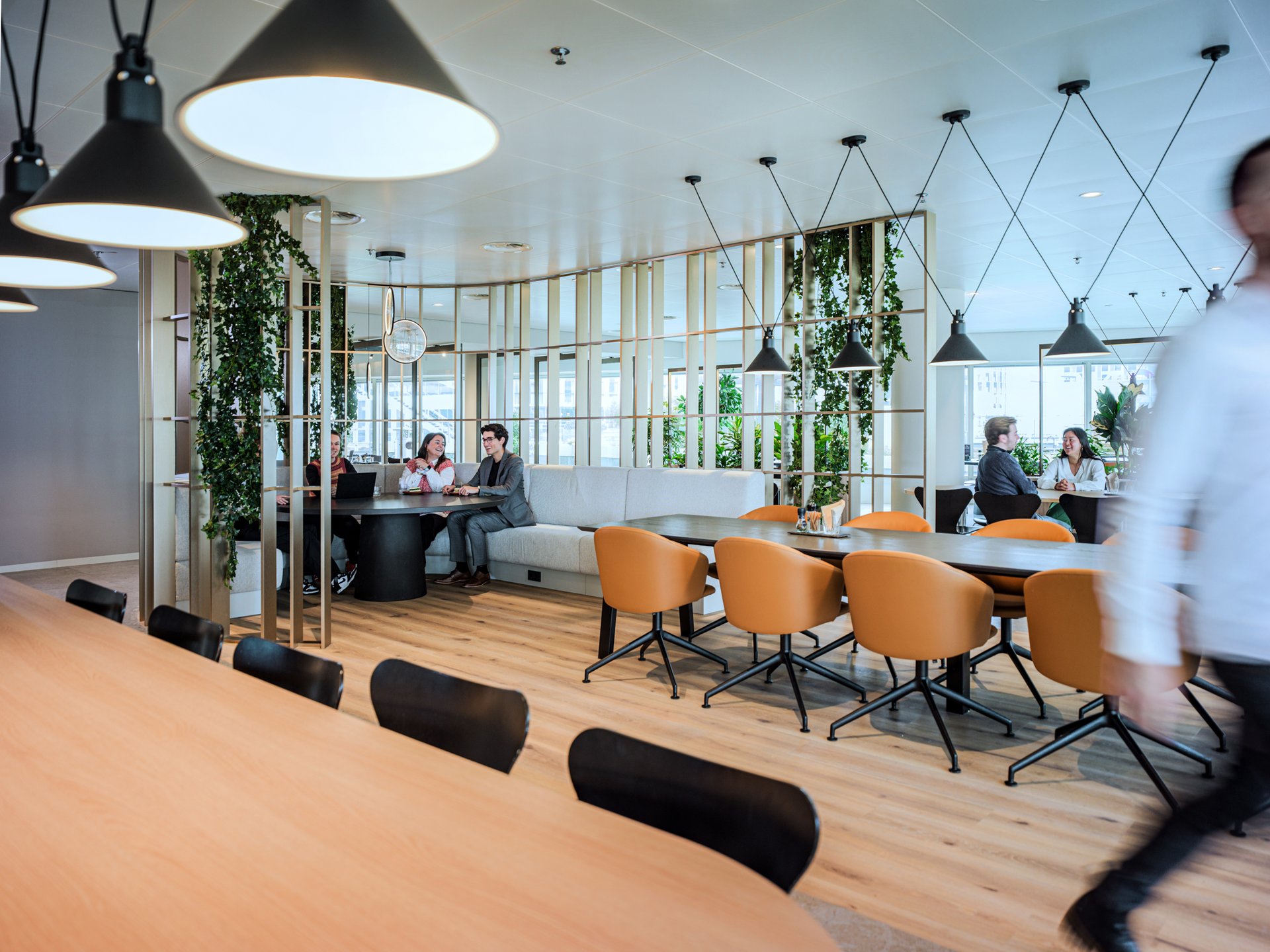
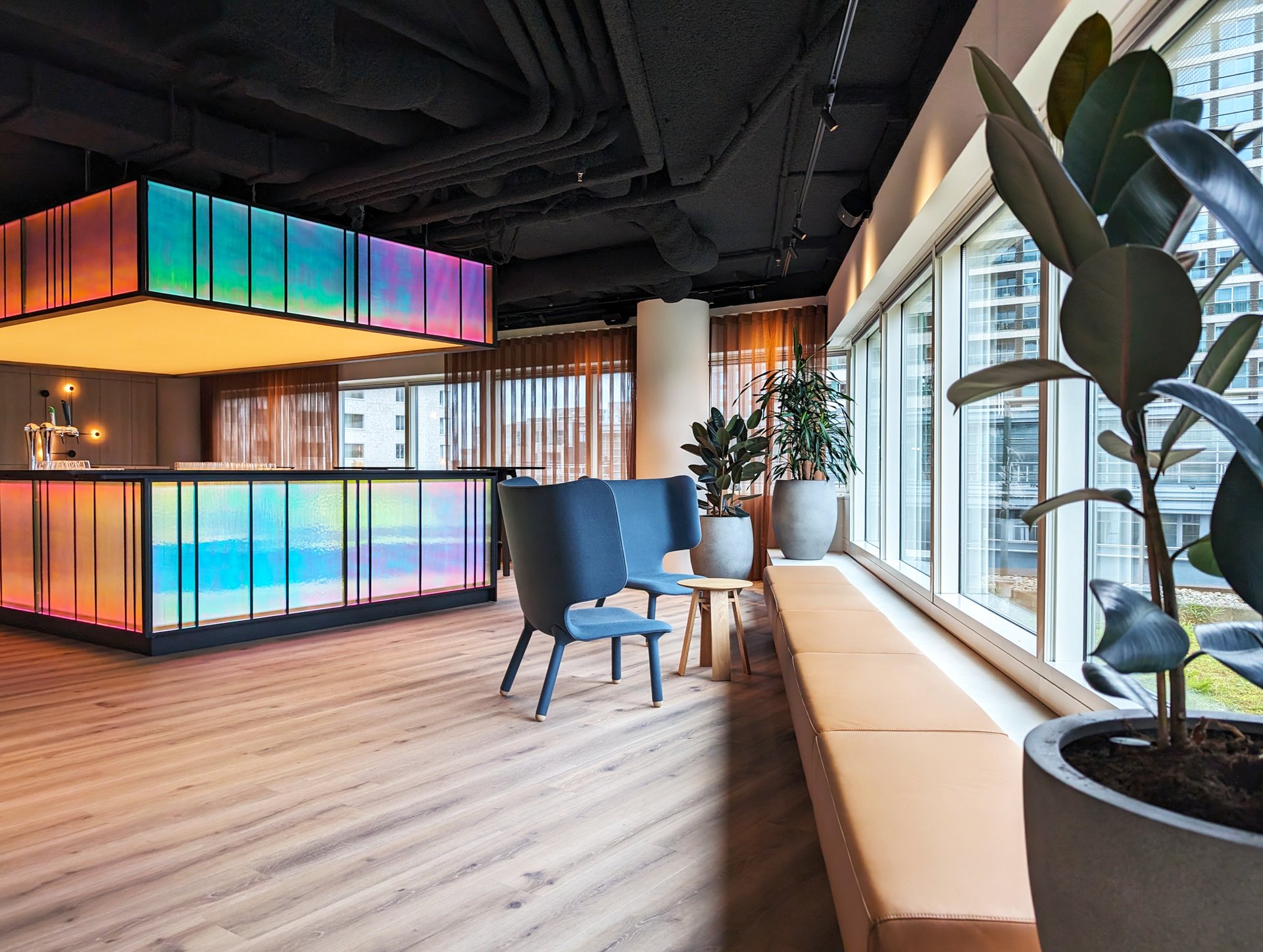
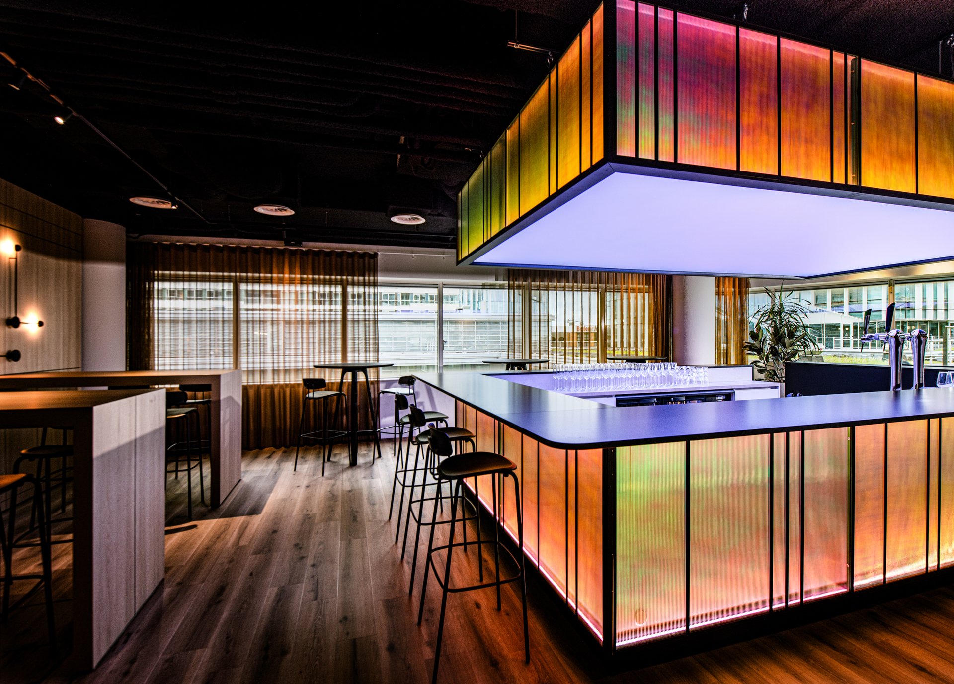
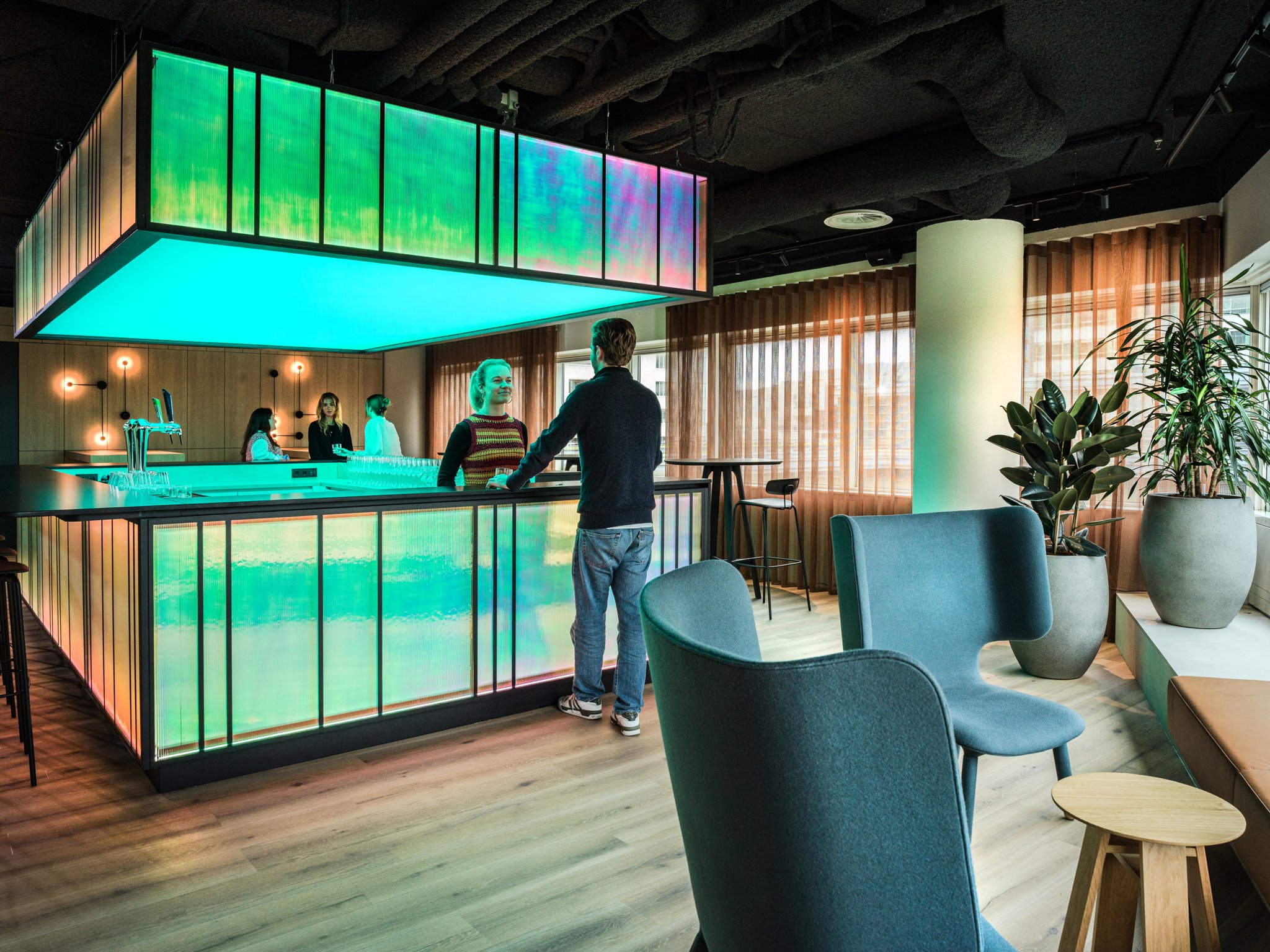
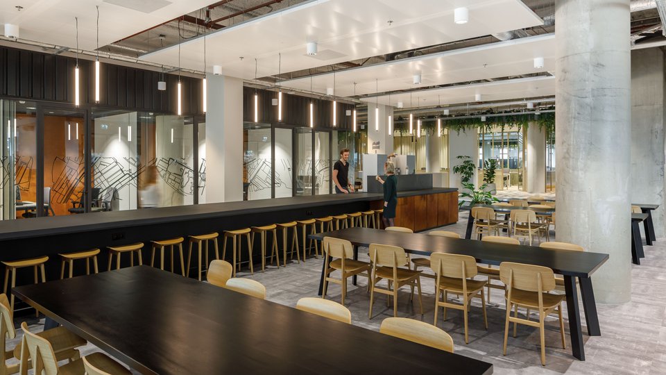
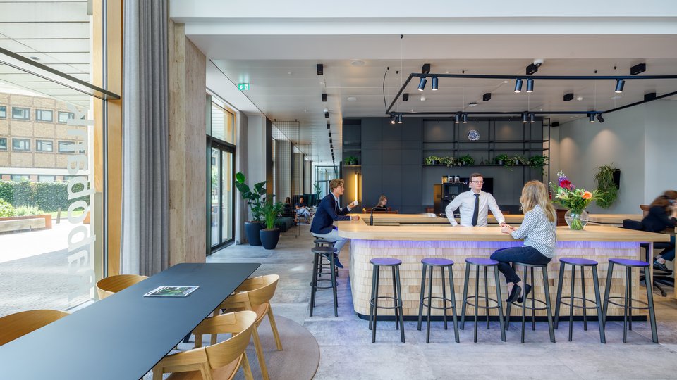
Houthoff, one of the largest law firms in the Netherlands, prioritises employee well-being. This commitment is reflected in features such as the healthy restaurant menu and the creation of a highly comfortable and focused work environment, alongside spaces for relaxation, such as the night bar. From the beginning, the project brief was quite clear: create a warm and inviting environment centered on community and connection, while the interior exudes an international and comfortable atmosphere. Despite the considerable size (12,500 m²), we managed to create an office that maintains a personal and intimate atmosphere.
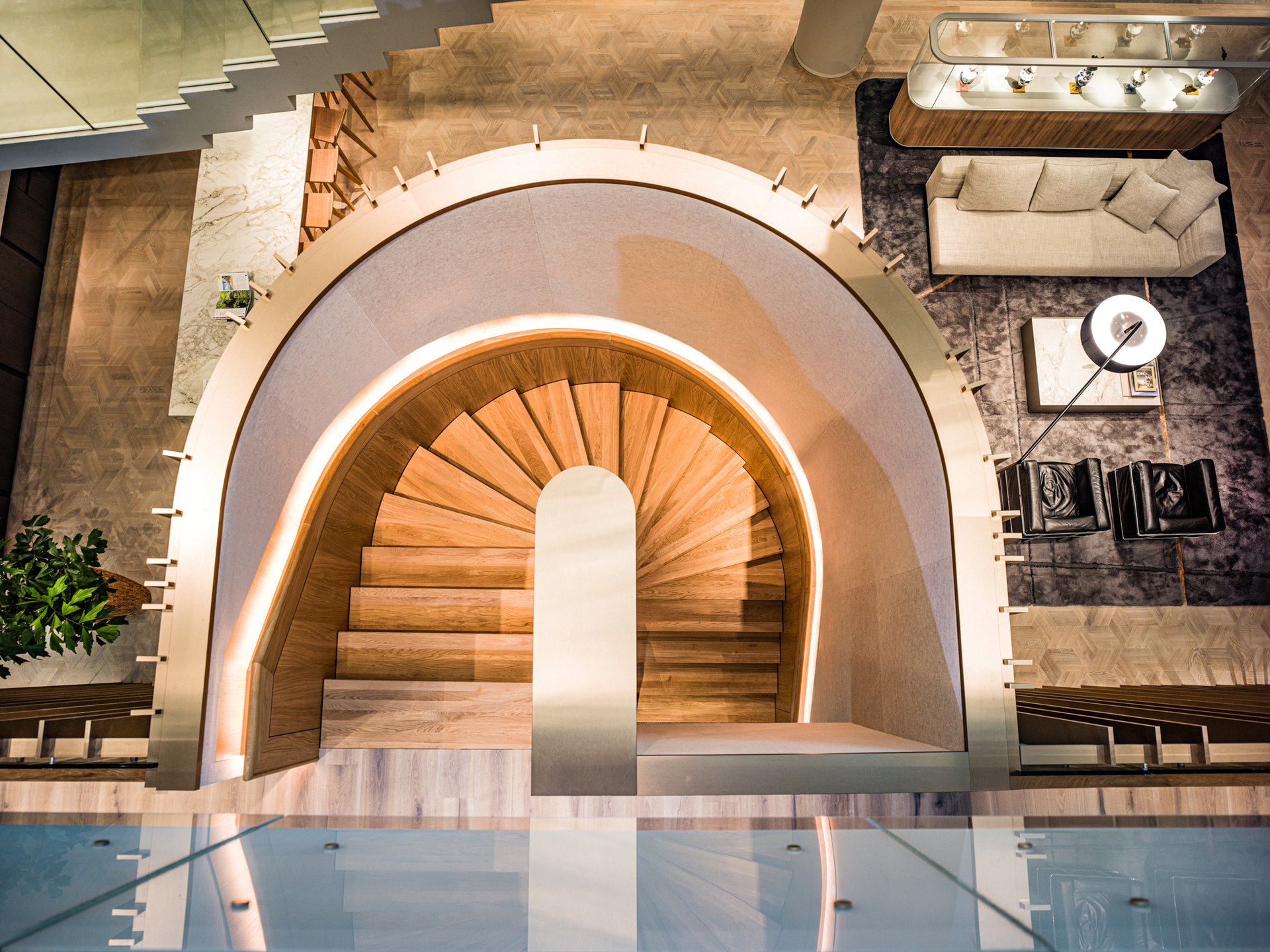
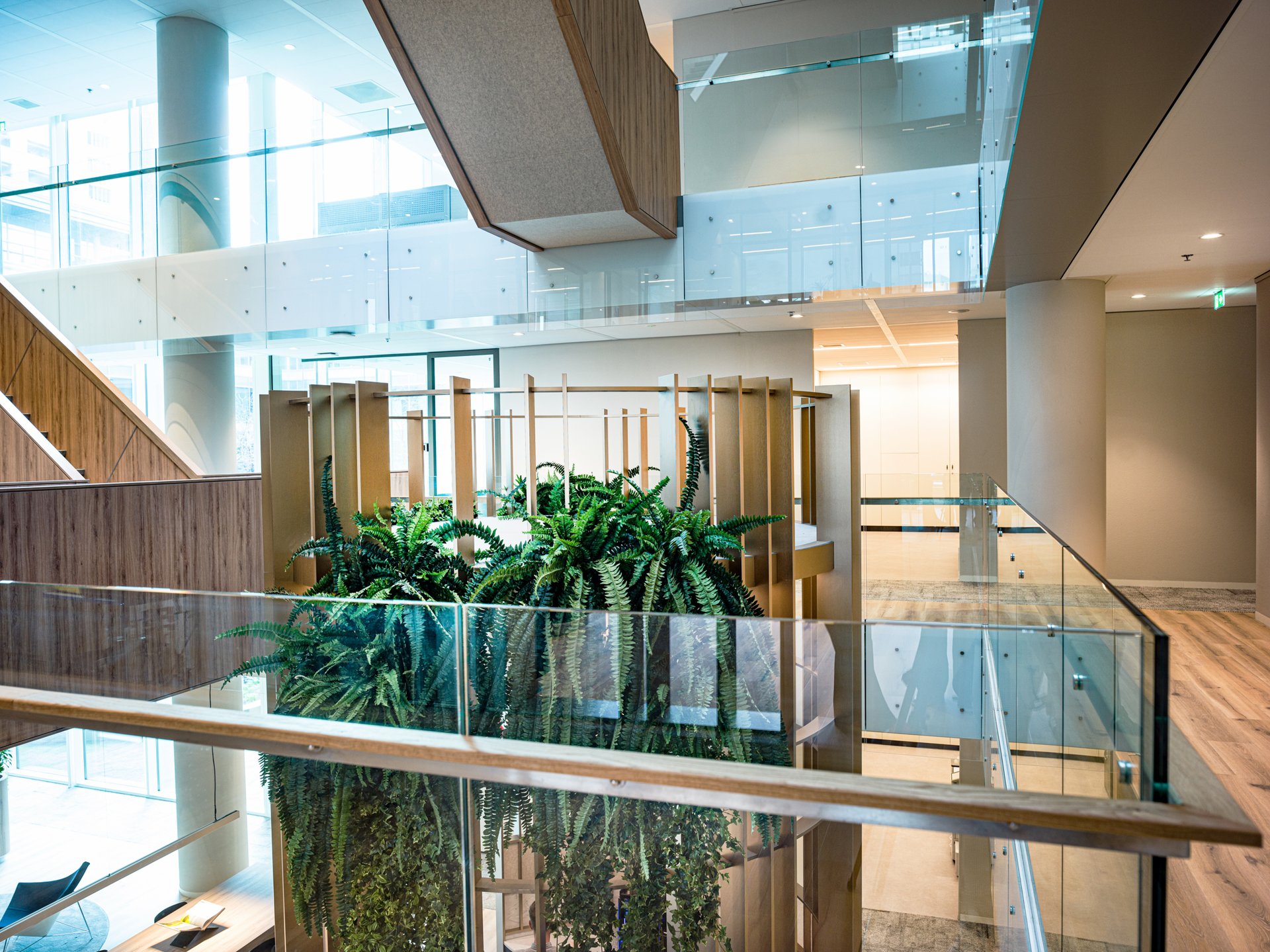
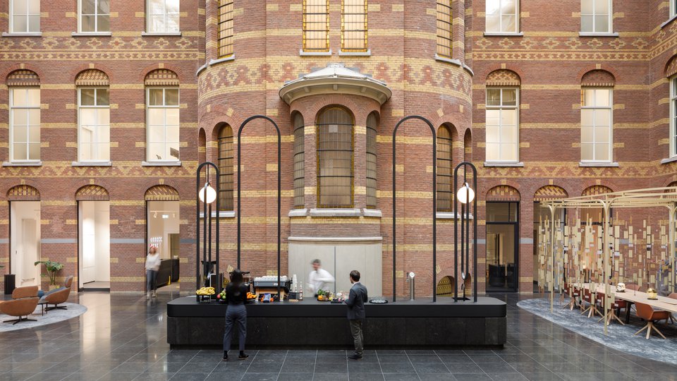
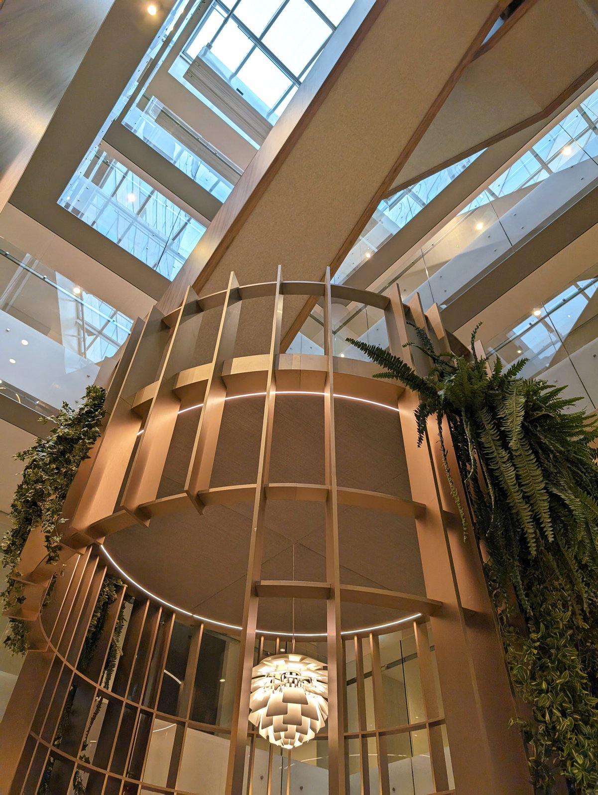
Each of these areas is marked by a unique object, designed in a cohesive design language, but varying in form and function.
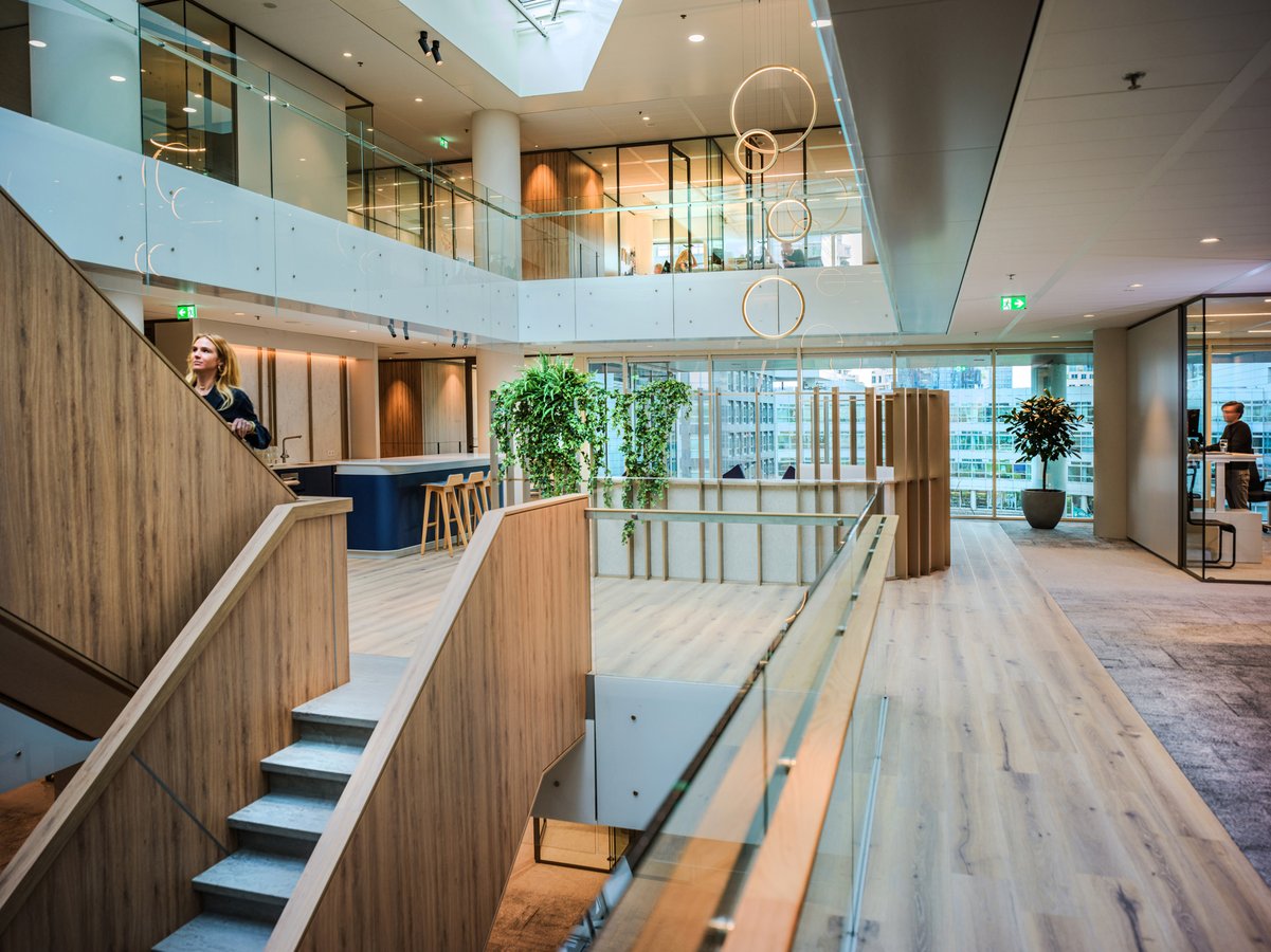
Finding well-being by spatiality
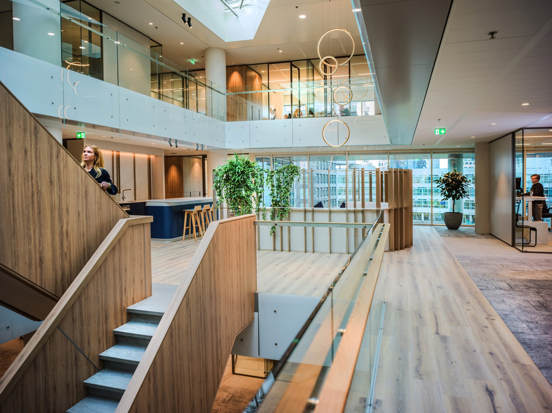
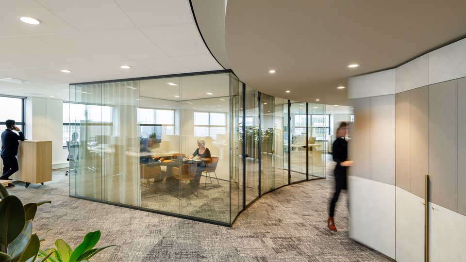
However, realising this vision presented challenges. The building's dominant structure and large-scale interior spaces, previously intended as workspaces, presented obstacles. Yet through meticulous design adjustments, we successfully relocated workspaces to the building perimeter, providing them direct access to natural daylight. We connected the interior spaces, to central community areas located in various atriums while enhancing the use of the existing stairs. Each of these areas is marked by a unique object, designed in a cohesive design language, but varying in form and function. This approach ensures there's always something new to discover on every floor.

Elegance and personality
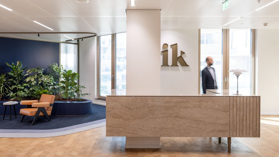
Key design elements, such as an irregular slatted pattern of metallic material and varied floor finishes, were used strategically to add depth and visual interest to the central community areas. Refined transitions in the interior finishes are complemented by neutral colour tones and dark profiles. The room-dividing cabinets and the materialisation of the social square feature wood and warm bronze tones, subtly different in texture. Every detail has been carefully considered, giving the design an elegant feel. Personalisation has been enhanced by the introduction of large planters and the placement of art on coloured surfaces. All to compose an office where the Houthoff community feels they belong.
Photography: Stefan Ammerlaan
Projectpartners: Stone-Projects, Branding, Finitouch, Dutch Light Pro, Arie Kraaijeveld, Maars, Studio Manon Garritsen, The Wool Studio
