| Client | Flora |
| Location | Wageningen |
| Square | 10.200 |
| Timeline | January 2020 - September 2022 |

Inside-out, outside-in
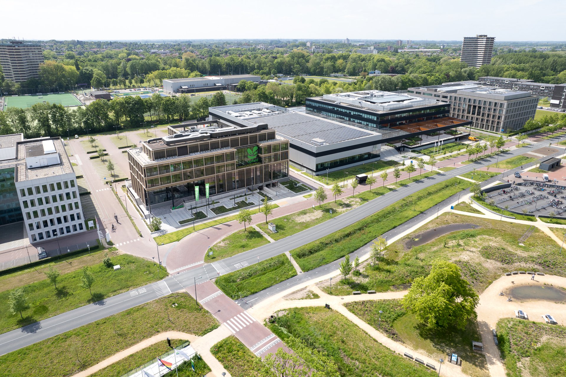
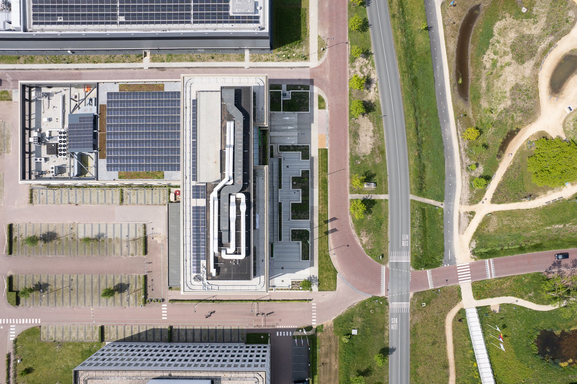
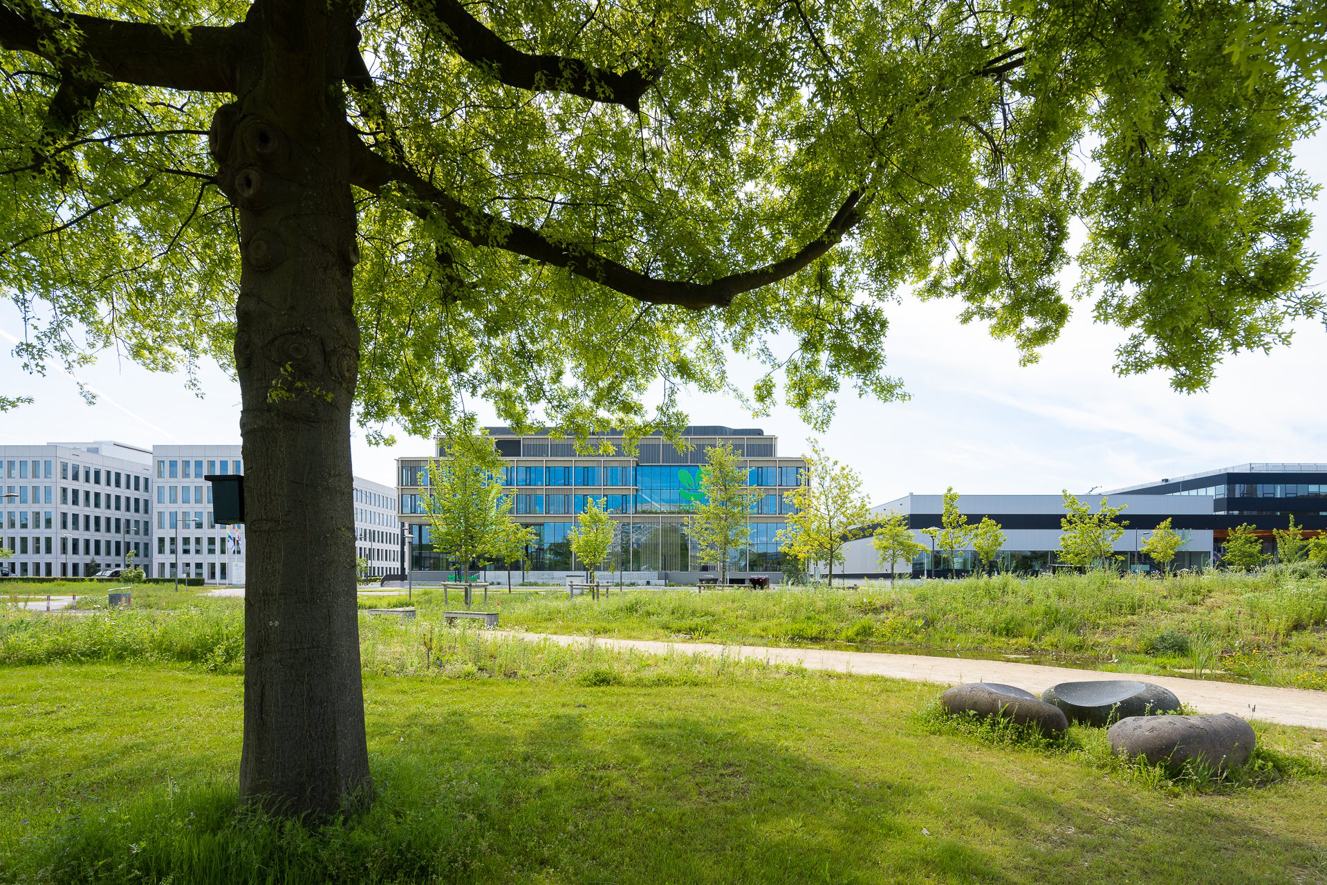
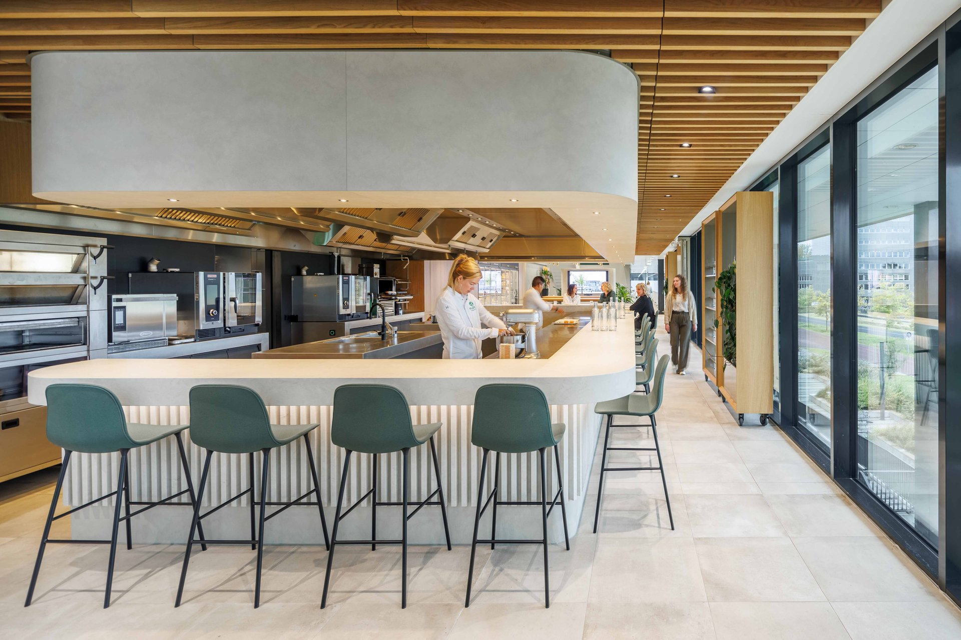
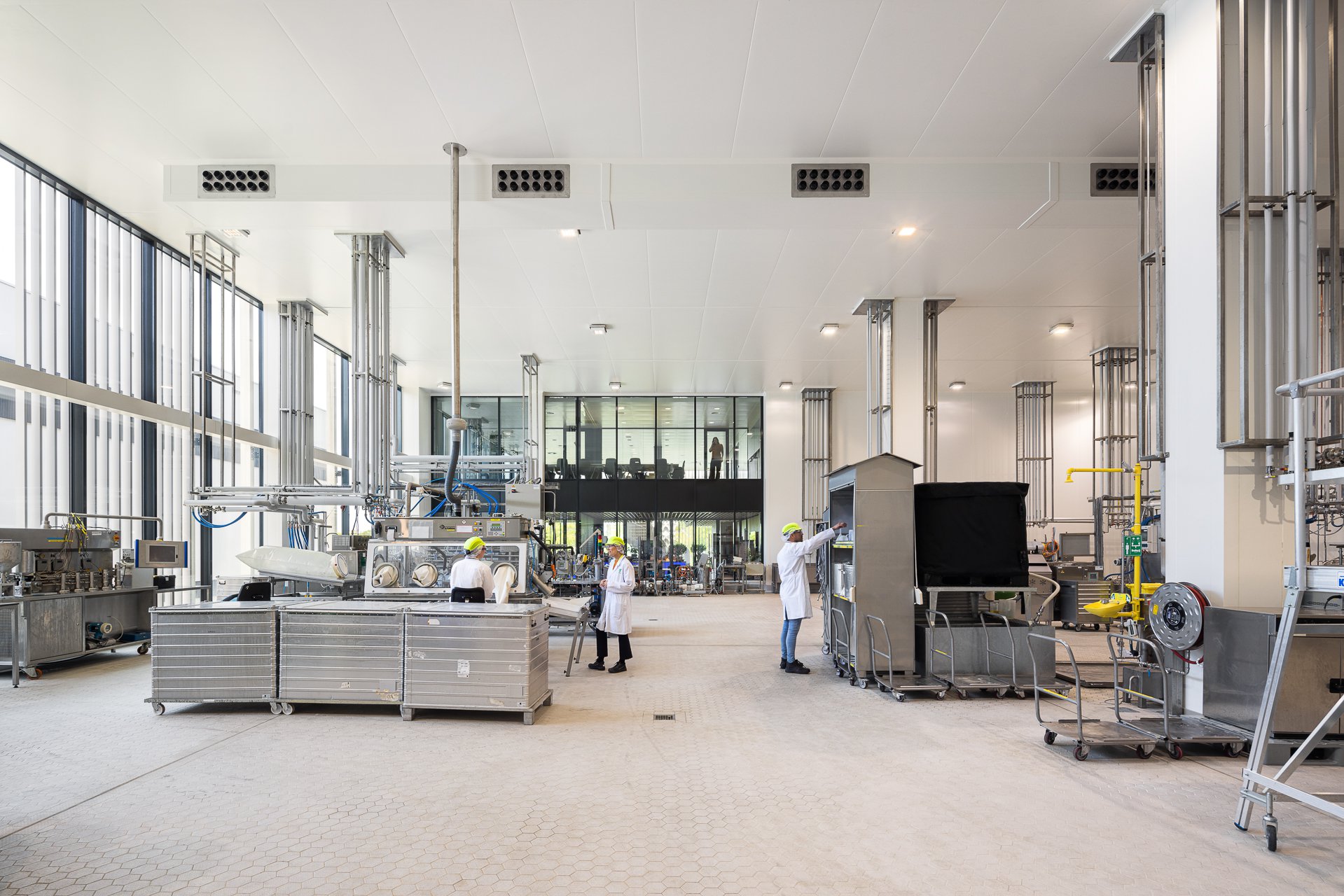
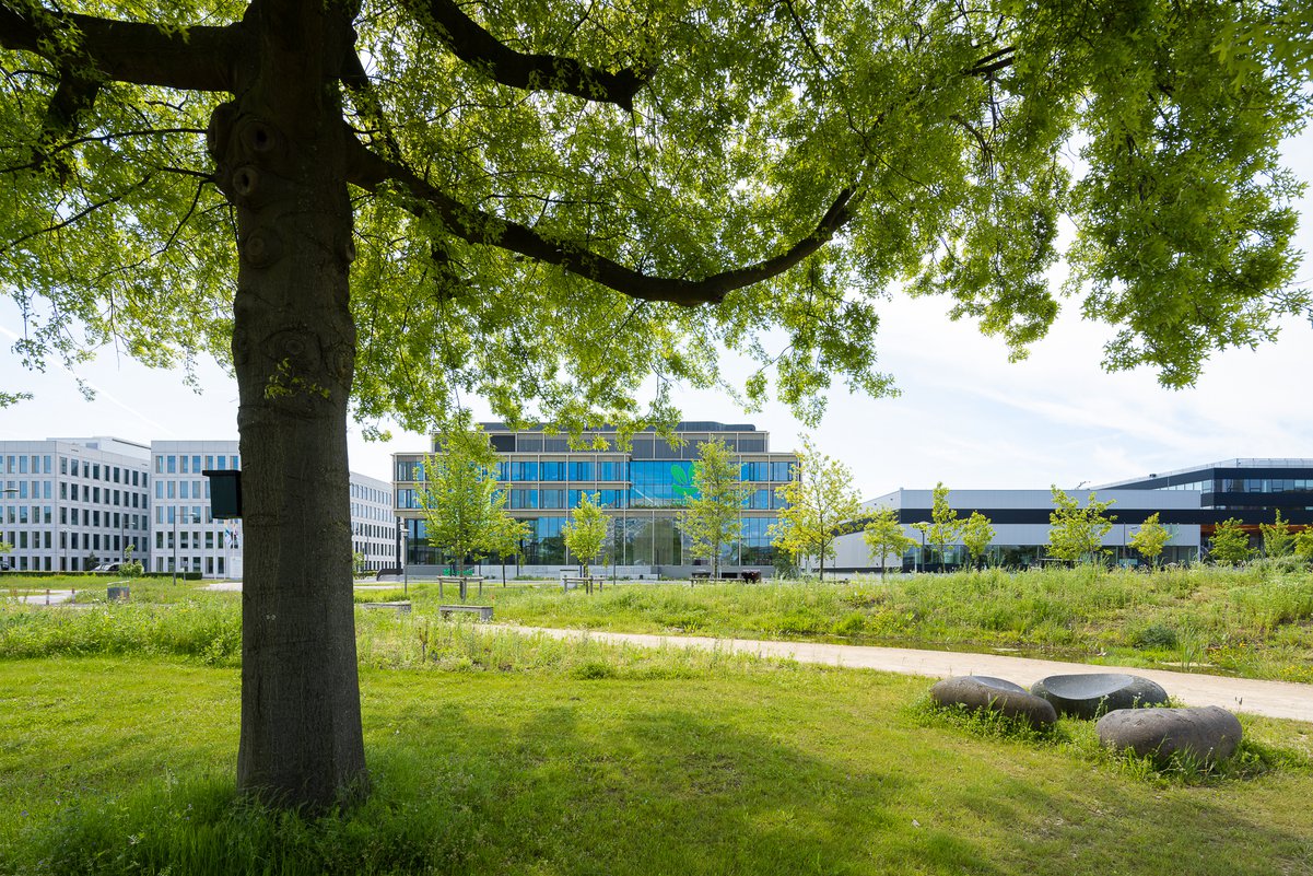
Flora decided in late 2019, to relocate its Research & Development office from Rotterdam to the Wageningen University & Research campus (WUR), also known as Food Valley, with the aim to seek collaboration with food companies, start-ups and the university. Fokkema & Partners was asked to design a building with 110 office workplaces, laboratories, a pilot plant, tasting kitchens and a company restaurant, on a centrally located L-shaped plot.

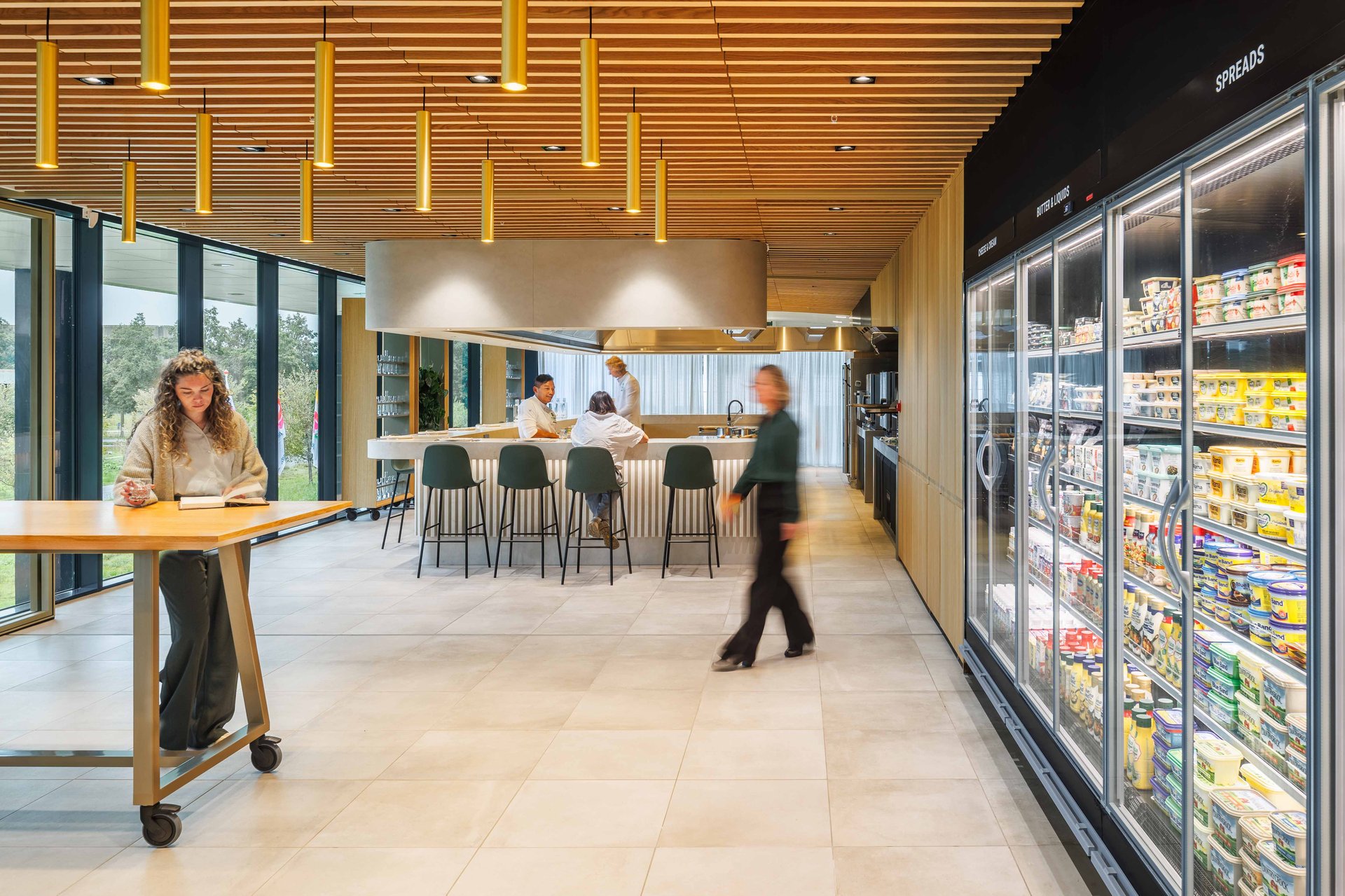
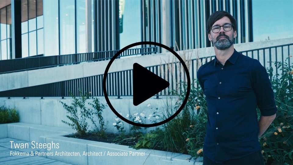
Project architect Twan Steeghs: 'Upfield is the first complete building design, that embodies our sustainability ambitions, from facade to furniture. A tailor-made fit, in which interior and exterior seamlessly merge, designed from a user's perspective and capturing the experience of the green campus. The outcome is a welcoming, green architecture, that opens up to its surroundings. We literally put the products and production processes on display.'
A clear structure
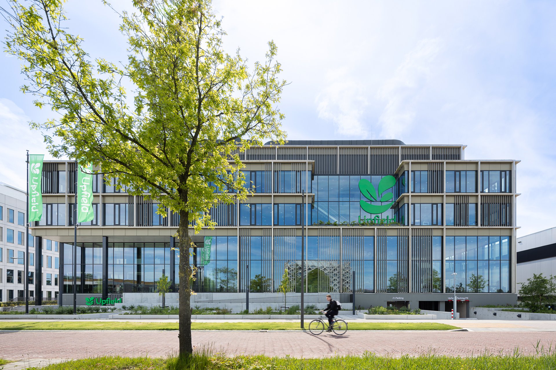
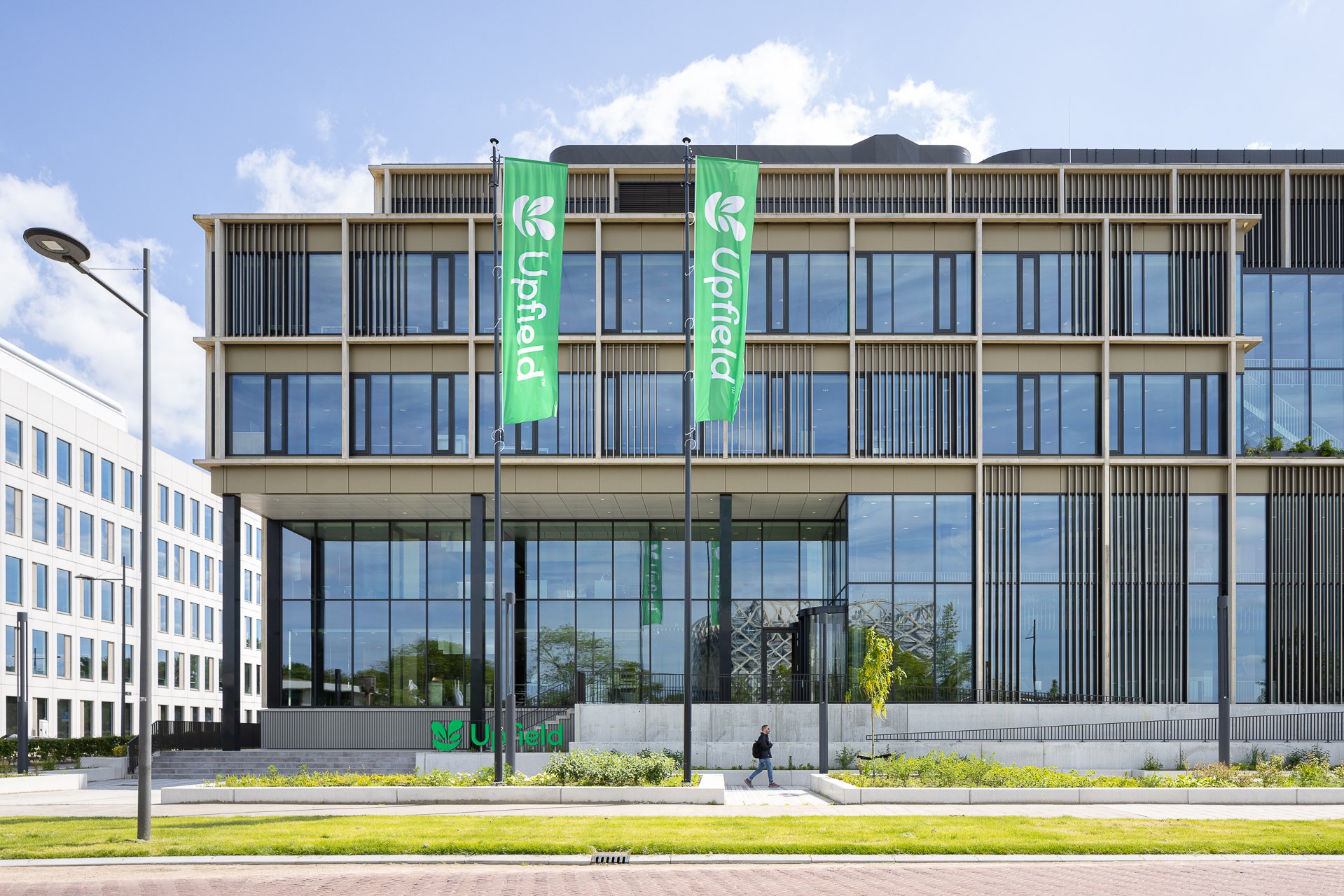
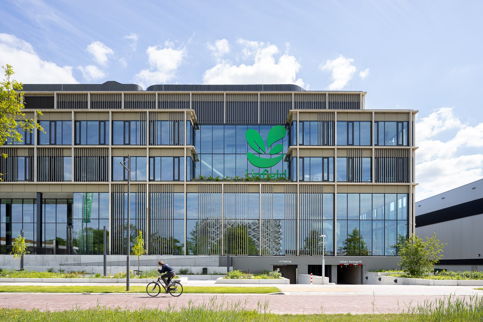
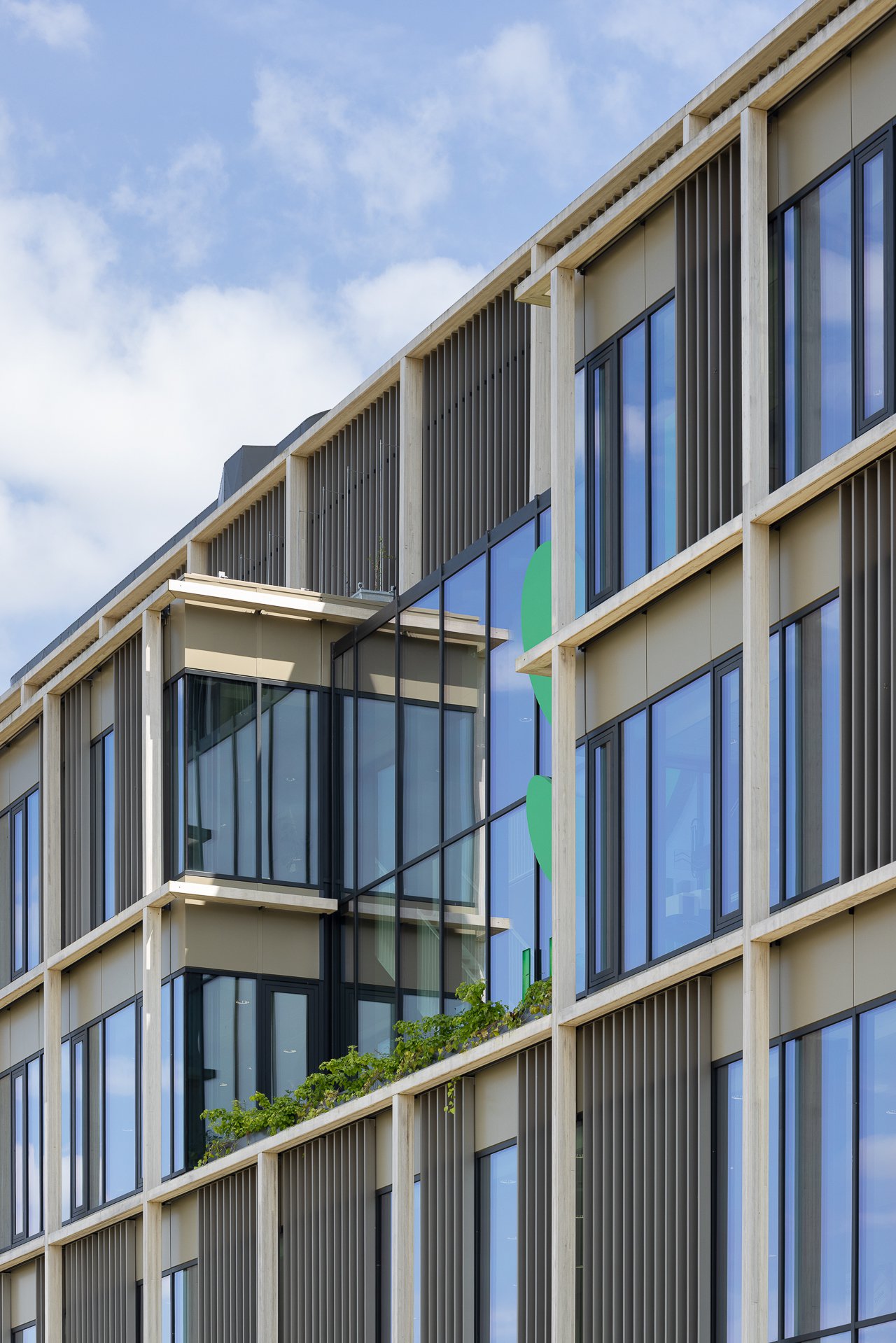
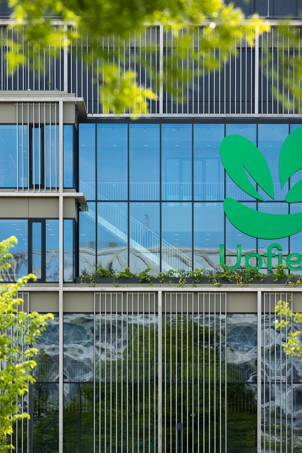
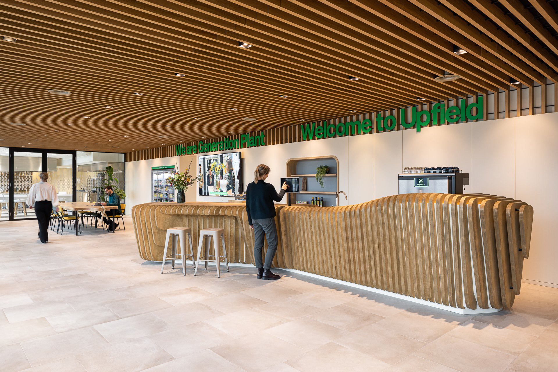
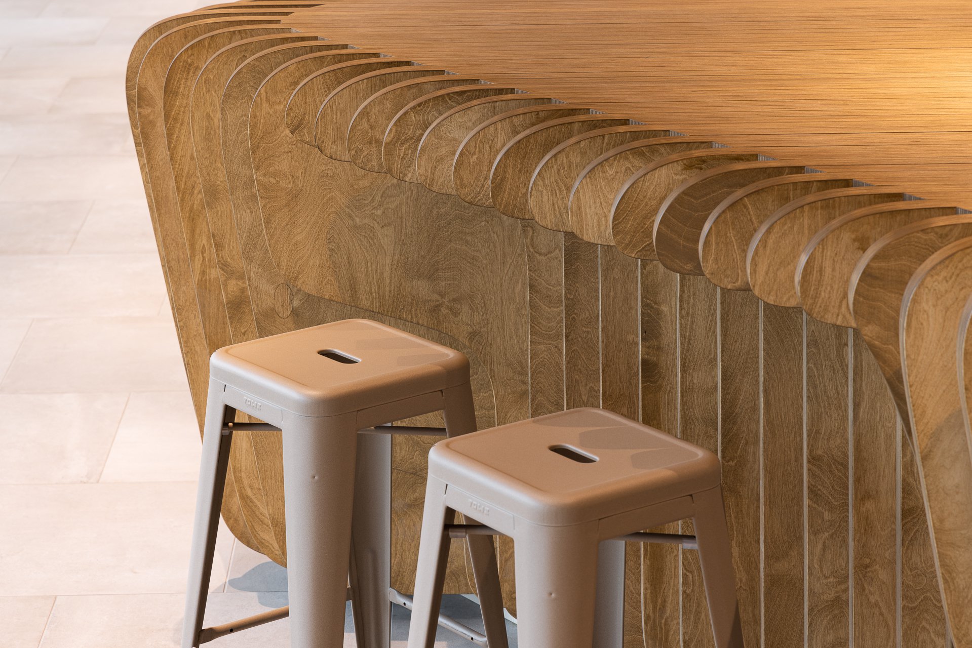
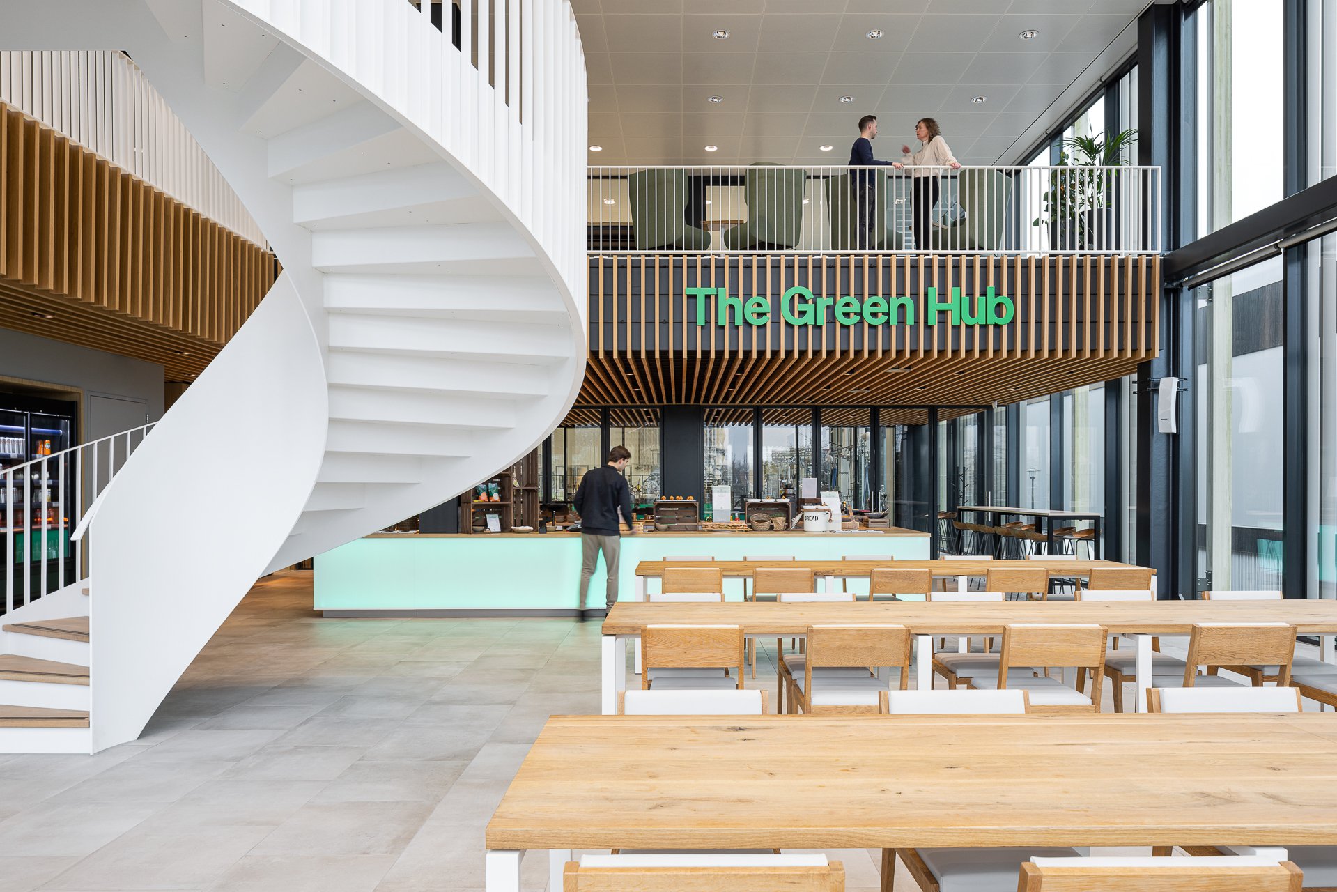
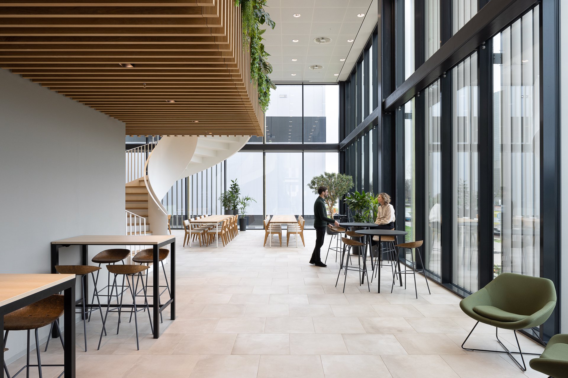
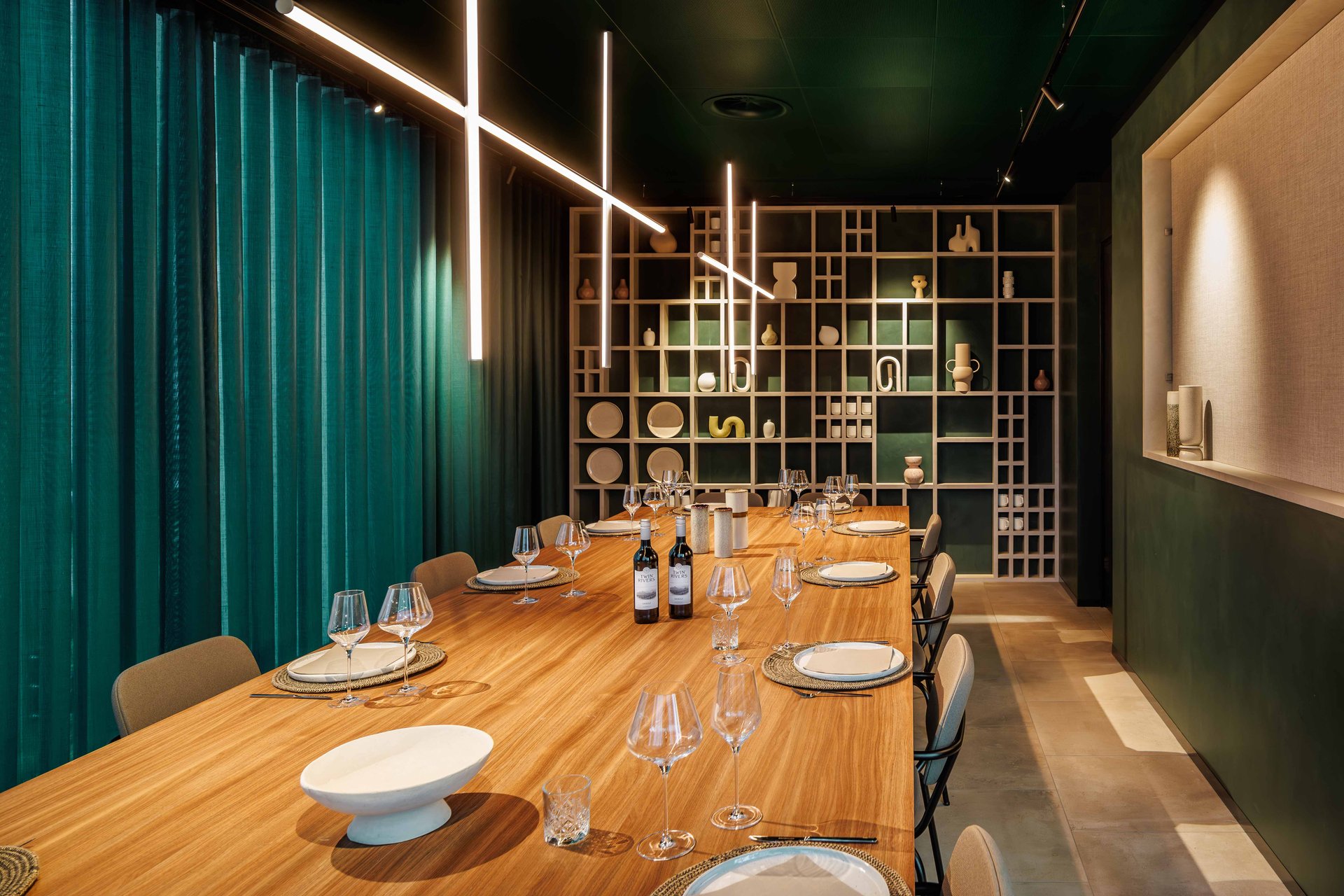
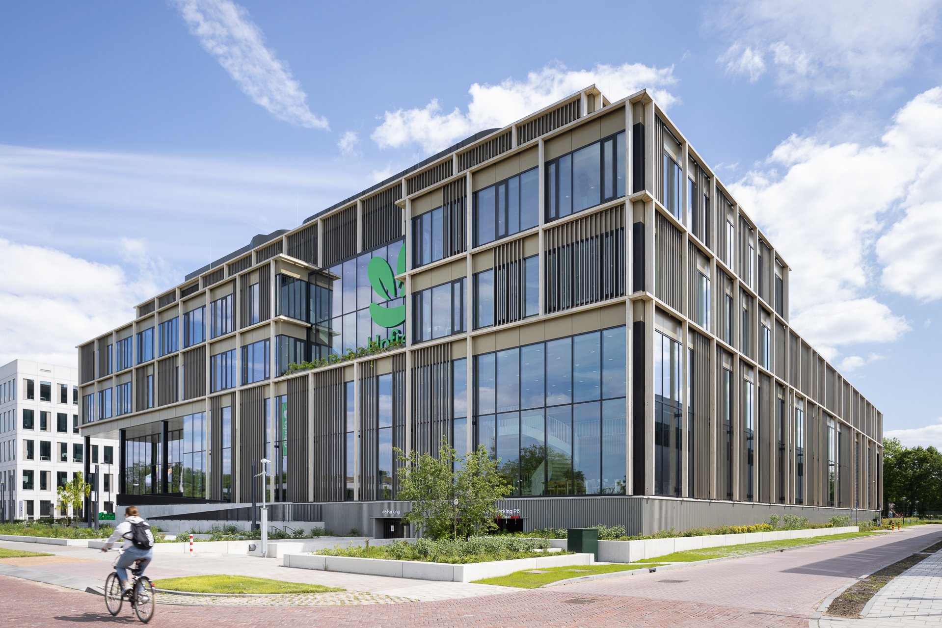
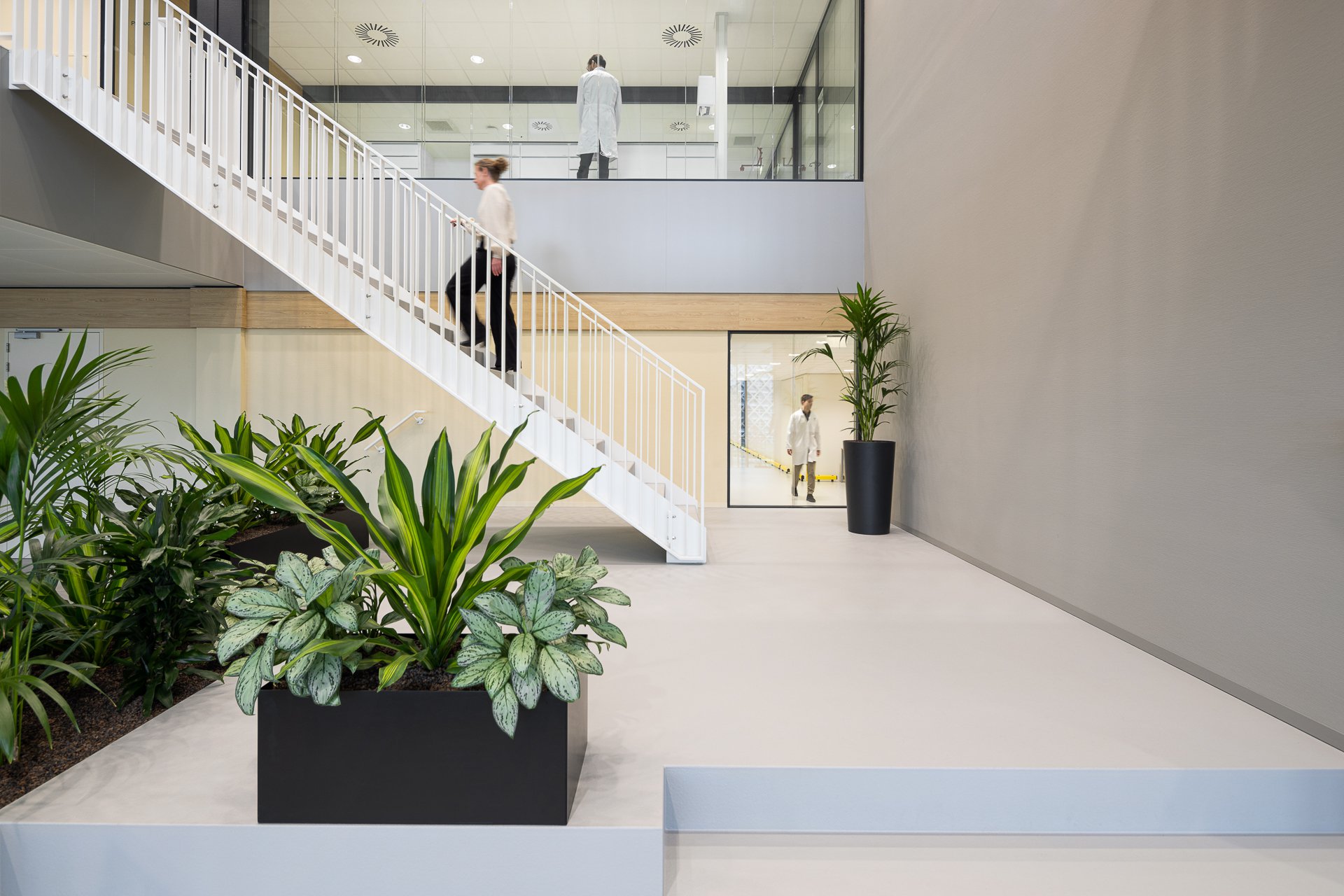
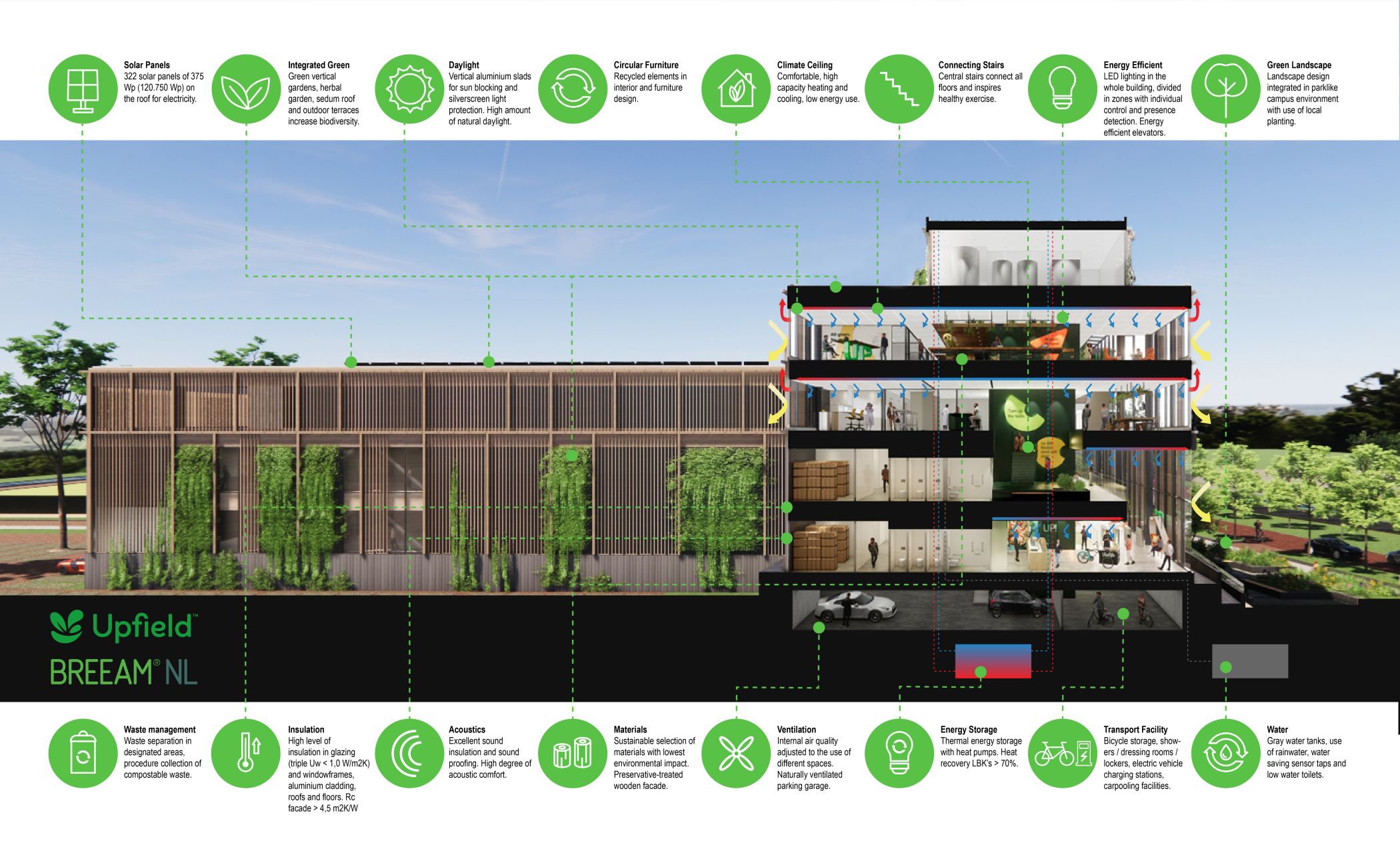
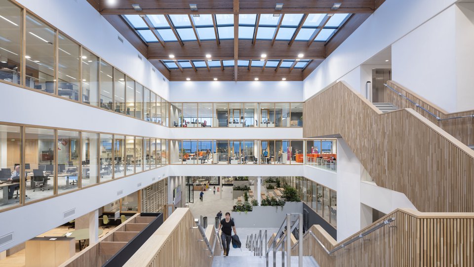
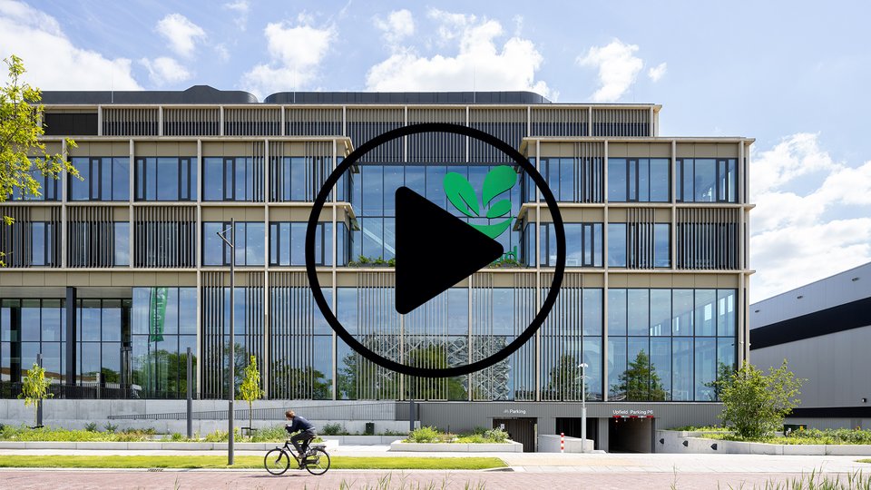
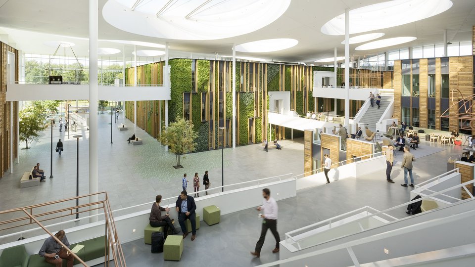
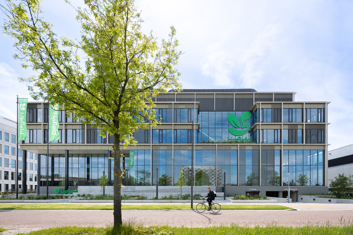
The building, composed of a steel structure and precast concrete floors, has a rational layout. The transparent main volume houses the office functions and laboratories, while perpendicular to that the pilot plant, expedition and logistics are positioned. Elevators and stairs converge at the junction, with a semi-sunken parking garage below. The recessed top floor, conceals the installations. An aluminum façade wraps the building, covered with a wooden frame, along which plants grow. Visitors access the building via a lush courtyard, leading to a spacious stairs and a ramp. The double-height entrance hall, with a wooden reception desk, offers direct views of the tasting kitchen, company restaurant, and offices above, overlooking the green campus. Cutting board-inspired tables pay homage to the butter developed by Flora.
Interaction and movement
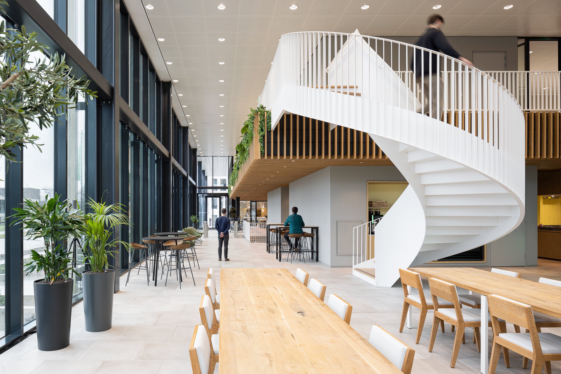
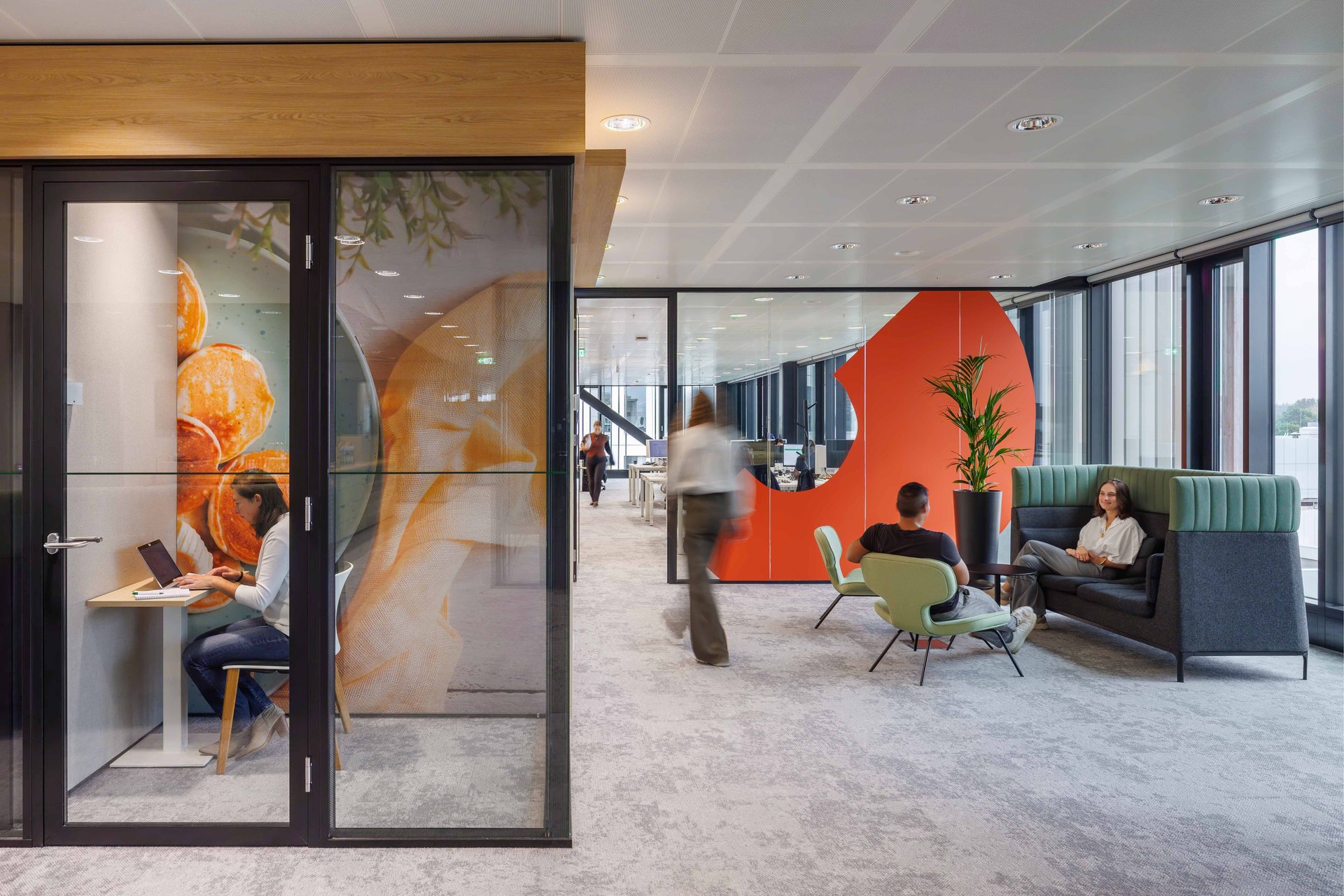
Clear pathways, where open stairs are strategically positioned in plain sight, make it easy to navigate the building. These traffic areas serve a social function, by connecting the stairs to communal spaces like pantries and meeting areas. A dynamic work environment is created that encourages movement and social interaction. The design allows for visual connections between the offices, laboratories and pilot plant. Steeghs: 'Through this mutual contact, you experience the process of thinking back and forth, testing, adjusting, researching; the fact that you are working together on the products of the future.' The office floors allow for easy and flexible partitioning, contributing to the building’s sustainable BREEAM Outstanding certification.
Natural expression
‘How do you express a sustainable way of building, without falling into dogmatic use of form and materials? That question was an important starting point for the architectural design', says Diederik Fokkema. 'Research reveals that our eyes are naturally inclined to perceive overall shapes first, before focusing on details. For instance, if we zoom in on a photo of buildings in Hong Kong, with their endless repetition of balconies, our eyes struggle to form a cohesive picture. That causes stress. However, when we look at an image of foliage, we instantly recognise the tree; the leaves and tree form a natural whole, offering a sense of tranquillity. This natural harmony became the essence we aimed to capture in this project.'
We set out to create the ultimate sustainable building for Flora, one designed from the inside out and with the user's well-being top of mind.

Growing greener
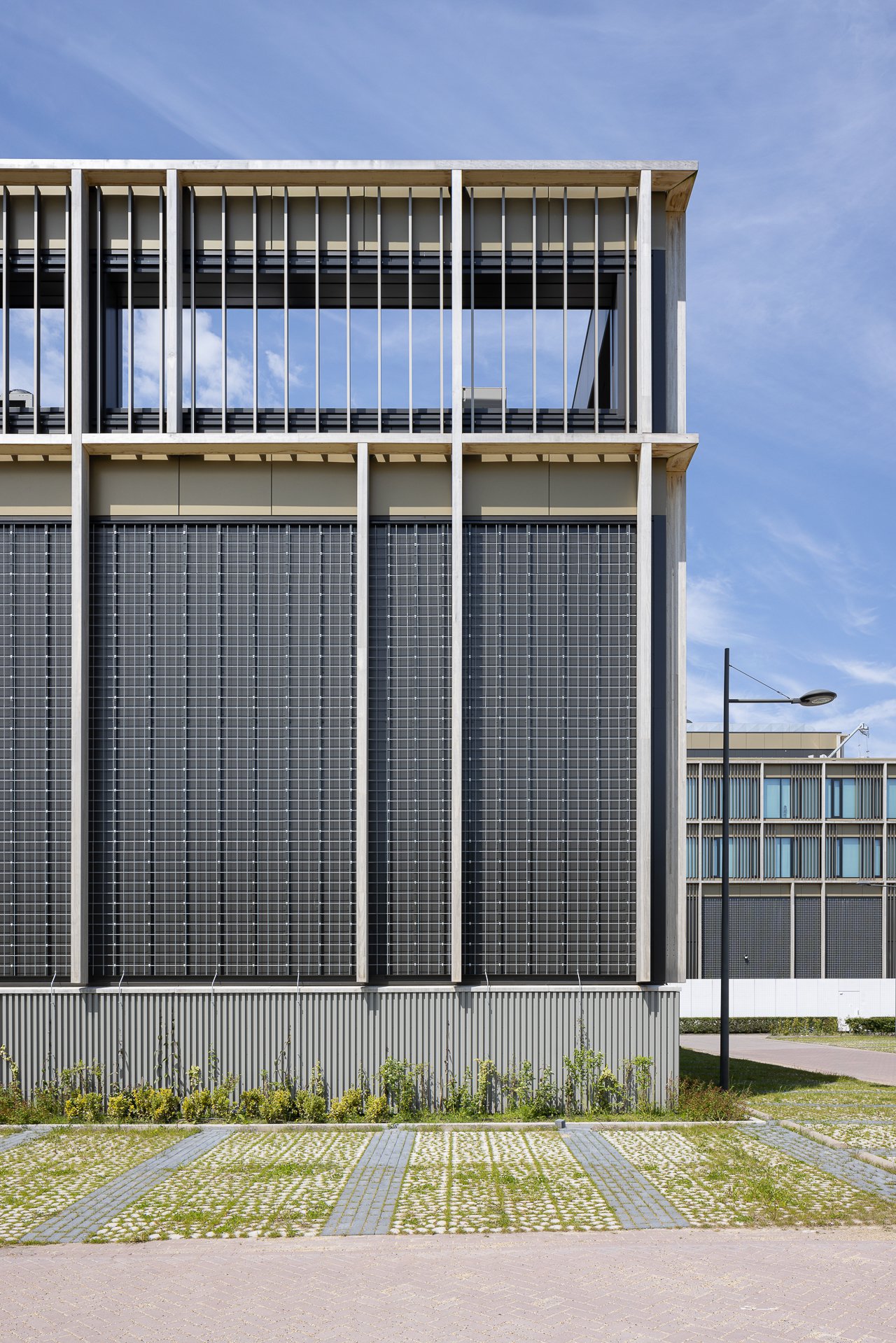
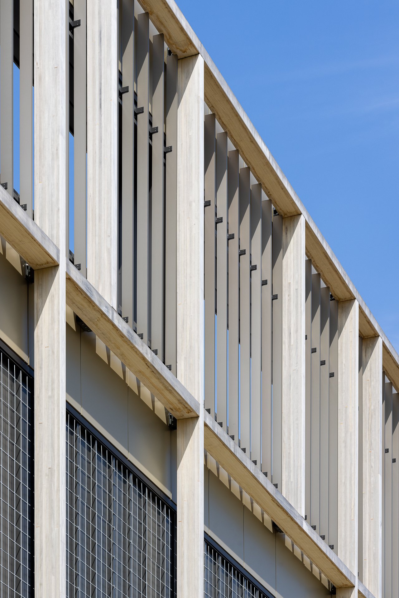
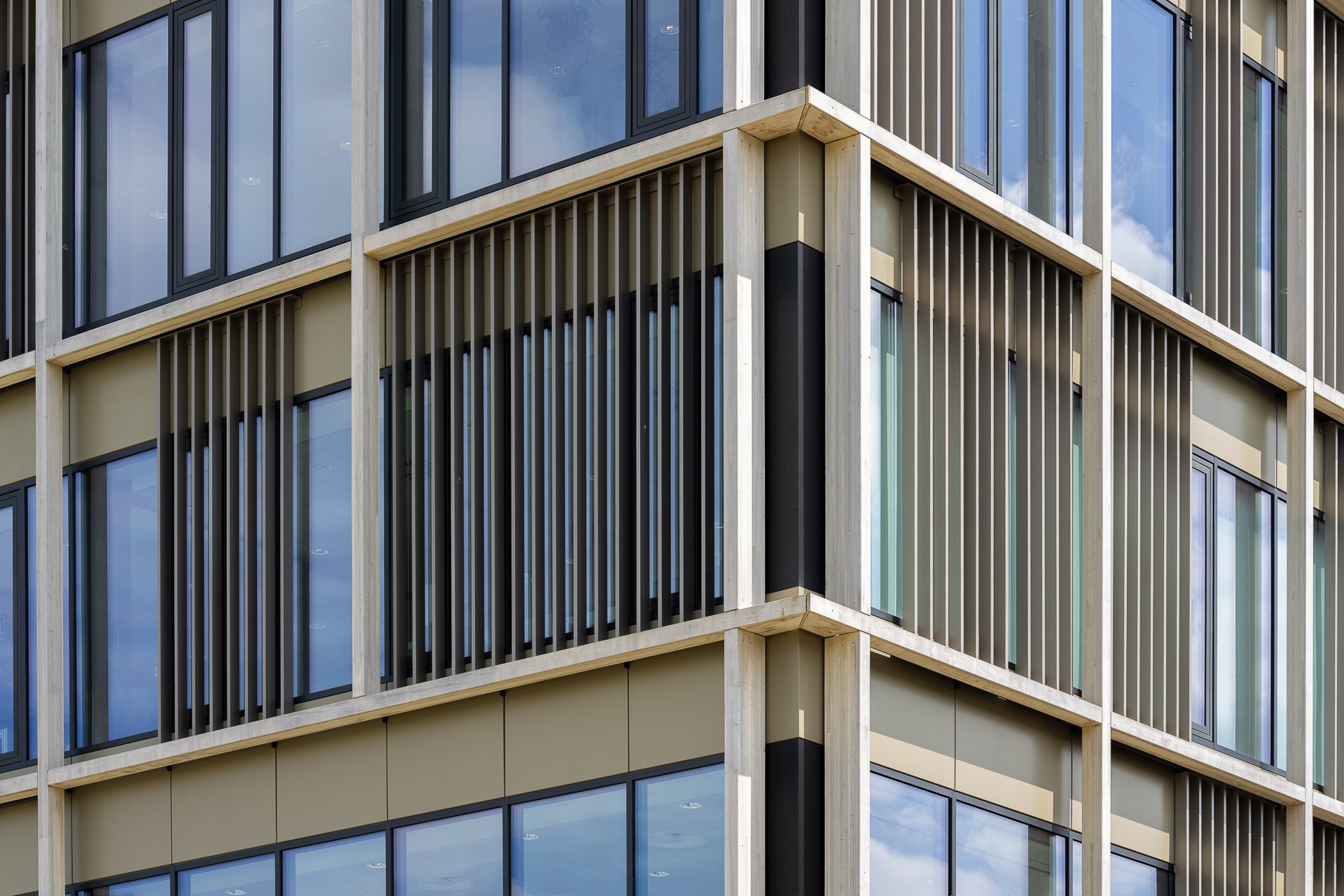
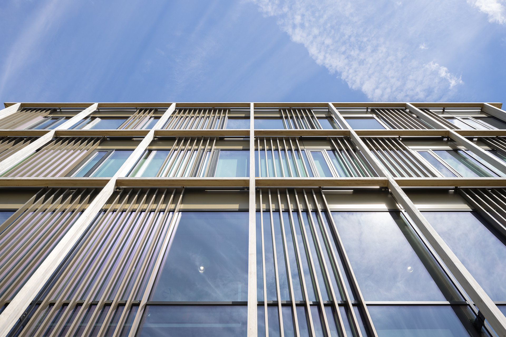
The wooden grid, designed to wrap around the building, creates a cohesive and captivating appearance, enhanced by the intricate arrangement of its diverse "branches". Deliberately placed at irregular intervals, the grid creates double-height windows, that offer vistas and abundant natural light. Adding depth and character, movable slat frames have been placed within the grid, providing texture and shade. Hanging plants grow and cascade down from the second-floor balcony. Closed sections of the façade are lined with metal mesh grids, acting as trellises for climbing plants growing upwards. As the seasons shift, the building will undergo a transformation, changing colour and gradually embracing the lush greenery; an enticing prospect for the future!
Project partners
Arcadis
Atelier Loos Van Vliet
Colliers
D&S Process Solutions
Van Wijnen Arnhem
Unica
Gielissen
Nelissen Ingenieursbureau
And more.
Photography Stijn Poelstra, Bram Vreugdenhil
Project text Kirsten Hannema
Click here to download the BREEAM-NL Case Study
