| Client | Google Nederland |
| Location | Amsterdam |
| Square | 3.700 |
| Timeline | June 2018 - July 2019 |
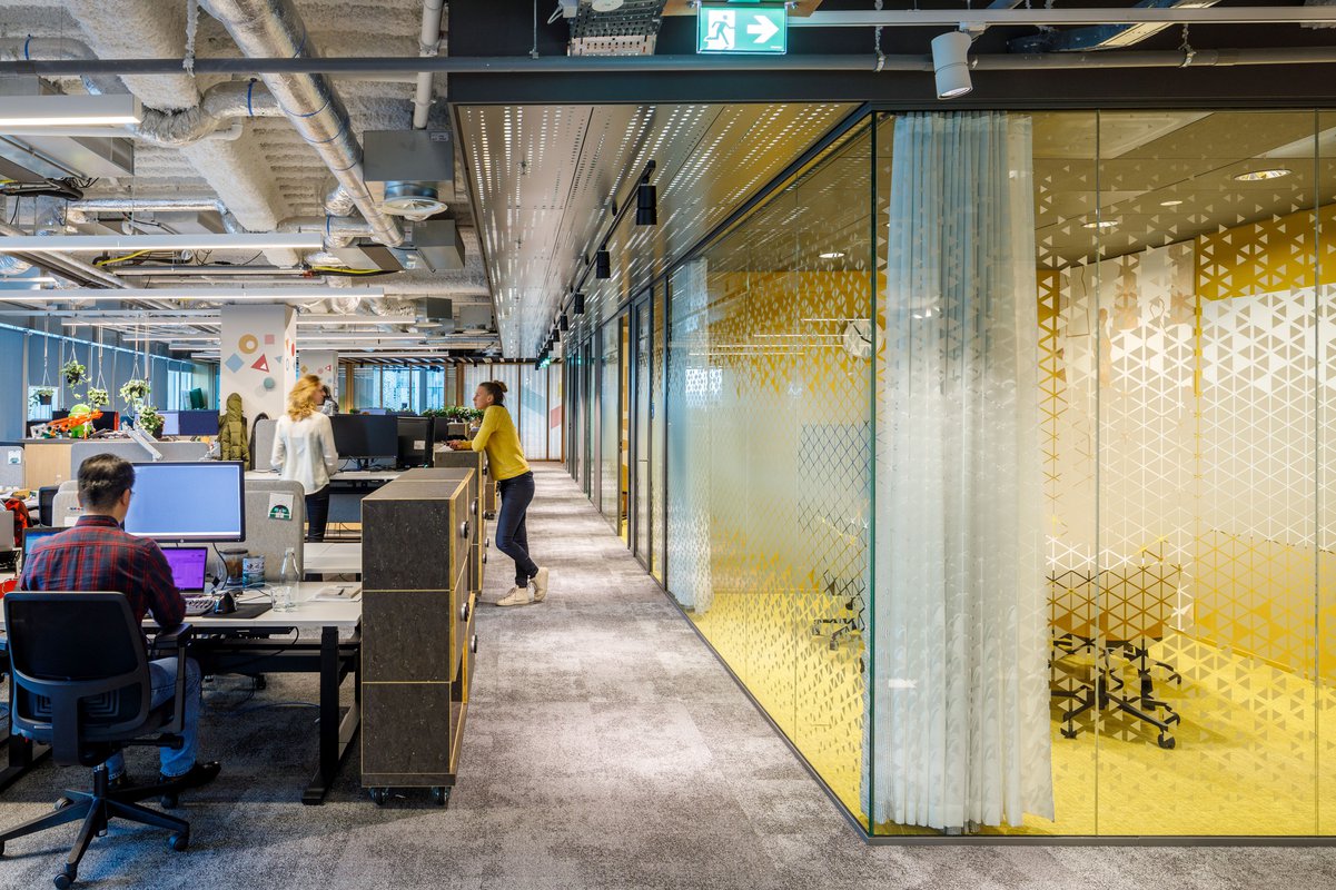
Due too rapid growth, Google rented two additional floors above their existing workspaces in Amsterdam. Fokkema & Partners was selected to create a masterplan for the integral office space, including the interior design of the new floors for Google. The design fits the worldwide workplace concepts for Google offices, tailored to local context and parameters.
Analysis on the way to most effectively employ the office led to a flexible design in which the density of workstations can be increased to solve a temporary overload.
A moody, edgy atmosphere
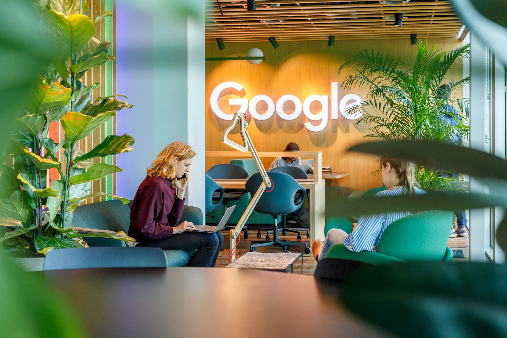
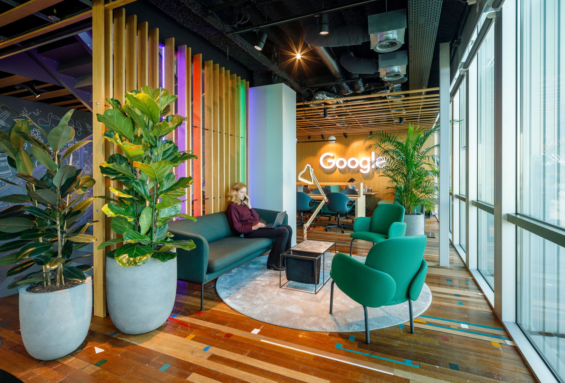
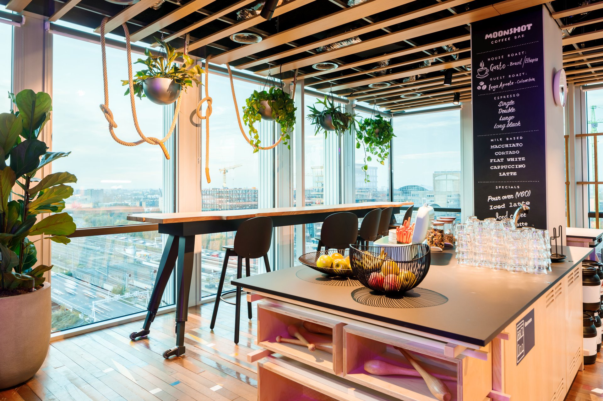
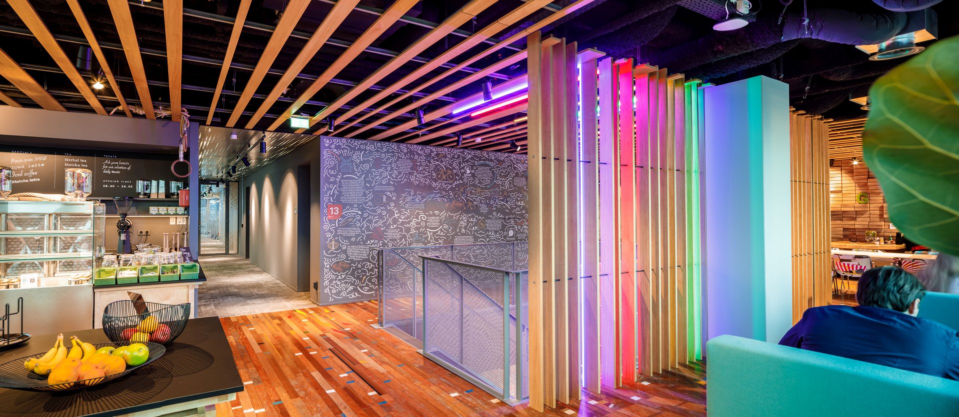
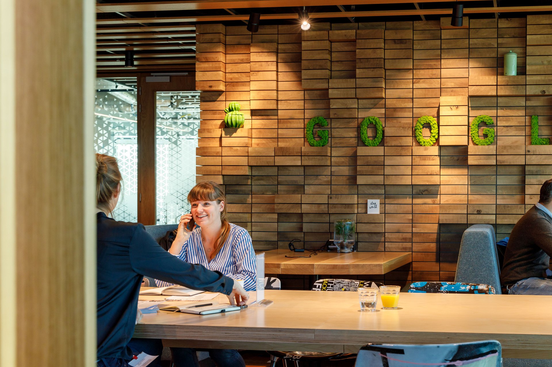
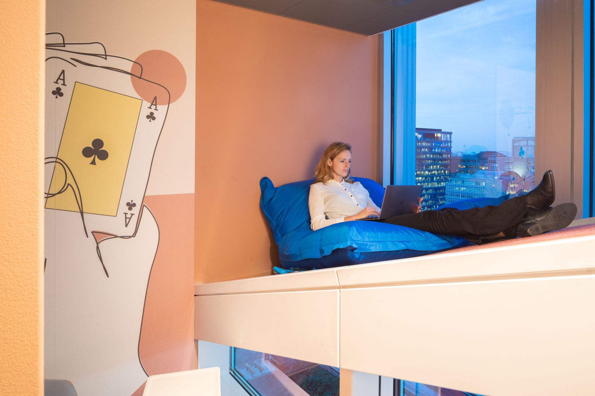
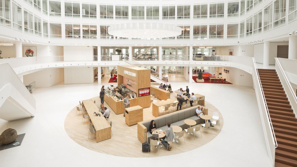
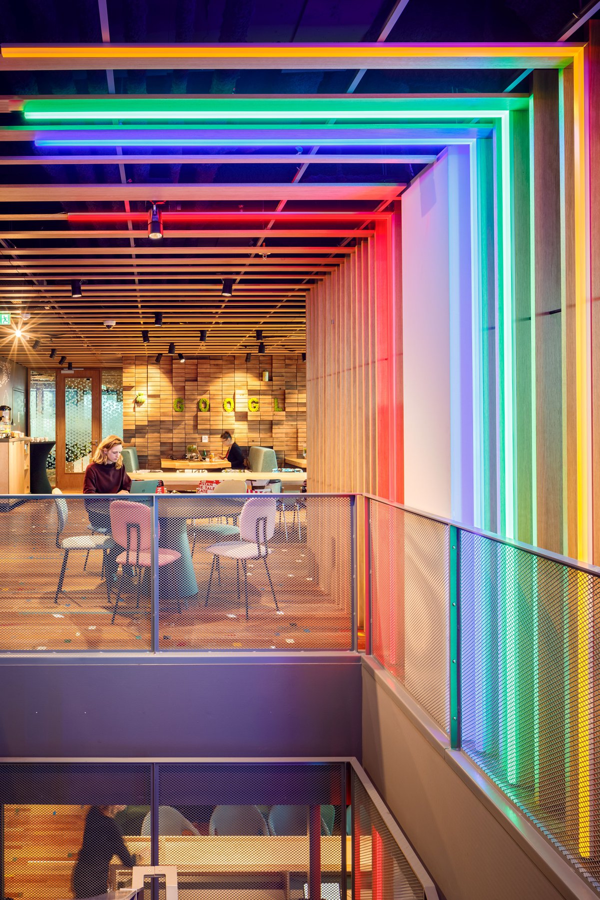
On the new floors of the Google Amsterdam office, the international teams find a moody, edgy atmosphere with spacious work zones and the urban café, all featuring amazing views over the city. The working cafe annex playroom was designed to bring people together and create an urban style break-out space. You can play shuffleboard after a meeting or select any of the boardgames. There are healthy foods at the bar and the interior is complemented with lots of natural green. Google employees and their guests lounge on the sofas with or without a laptop, a home away from home.
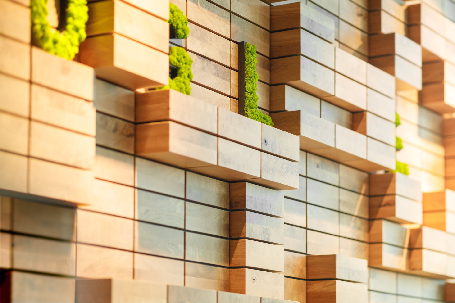
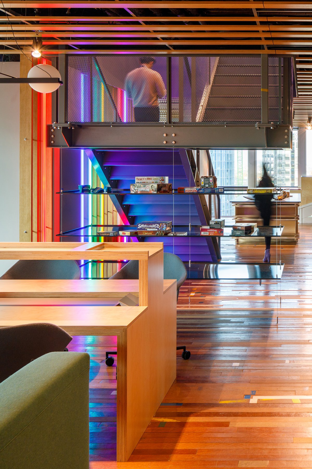
The wooden sports hall flooring in the cafe is a reclaimed material from an Amsterdam school gym. Dashes of colour line the floor like pieces of data. An iconic light feature which subtly portrayes the google colourscheme flanks the steel stairs interconnecting the two floors of this meeting hub. Measurements and detailing of the cupboards are designed with reference to the renowned Dutch ‘De Stijl’ tradition. The bar is made of an old tree that once grew in the city centre of Amsterdam. Together this creates a raw and unpolished look and feel to match the urban, slightly underground qualities of life in Amsterdam.
The working café is characterized by an iconic light feature which flanks the stair interconnecting two floors, and references to typical Dutch games and the famous ‘De Stijl’ elements.
Colour vs. raw materialisation in greys, black and white
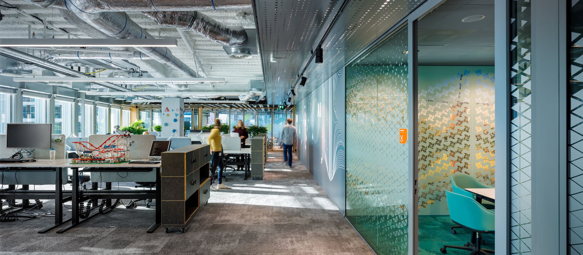
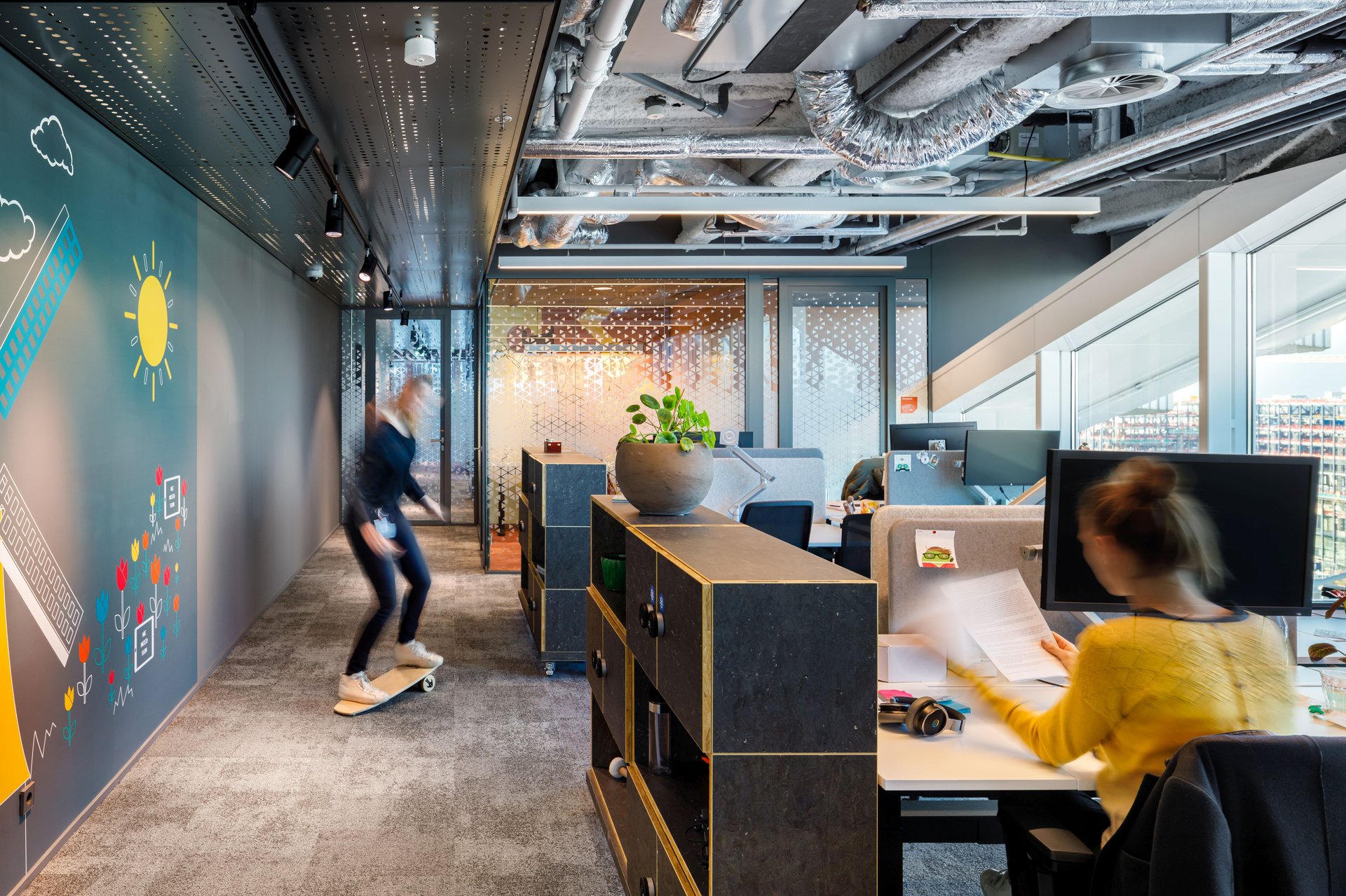
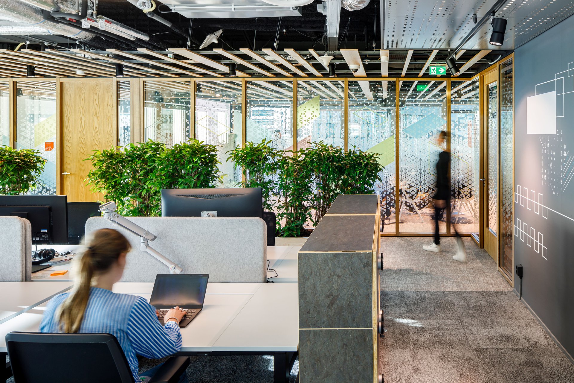
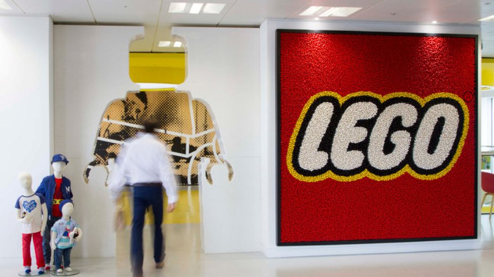
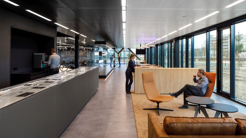
The workspaces are separated from the urban working cafe to create a different atmosphere and ensure good acoustics. It maintains a playful atmosphere, just one that is more personal and private, allowing for experiments. It is designed to foster team collaborations as well as concentrated working. Meeting spaces line the building core. In the open workspace around it you run into lots of plants, skateboards, interactive Lego installations hooked up to computers, fun toys, quotes and other personal expressions.
When moving from the urban working cafe to the workspaces you enter a corridor. It has a ceiling with integrated lighting that continues in the open workspace area. It wraps the meeting spaces around the building core. The lighting pattern reflects the dynamic in the data centres.
Space dividing cabinets are flexible and completely demountable as they are made without use of glue. Splashes of colour radiate from the meeting rooms around the building core. The workspace itself is materialised in greys, whites, blacks and dotted with plants. The people and their personalities give colour to this canvas, maximising the paths their creativity can take.
The custom lighting feature is designed in collaboration with BeersNielsen.
Photography by Bram Vreugdenhil.

