| Client | Brinkhof Amsterdam |
| Timeline | November 2018 – January 2021 |
| Square | 2.800 |
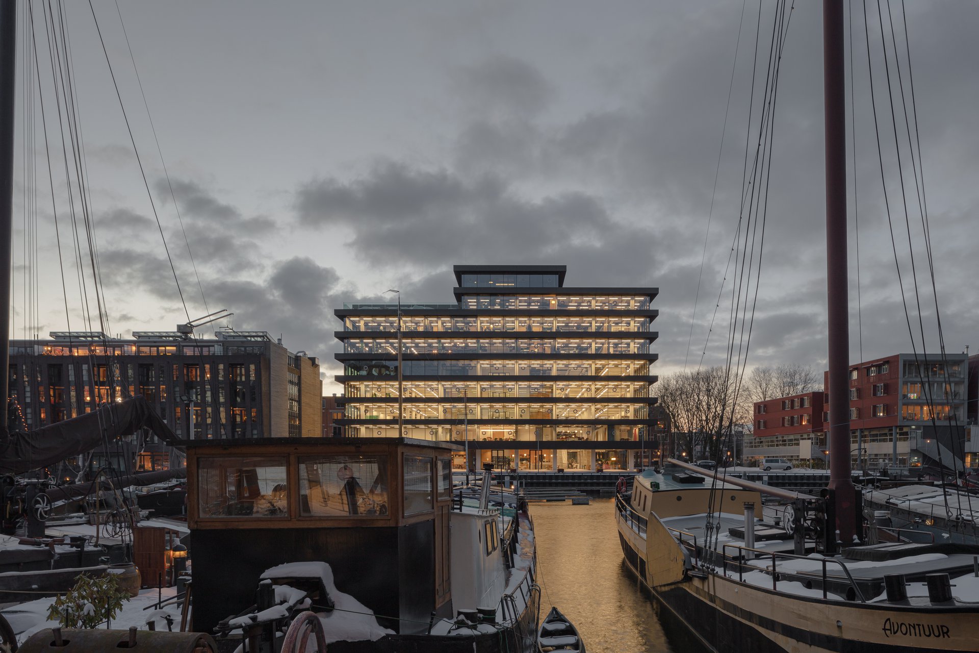
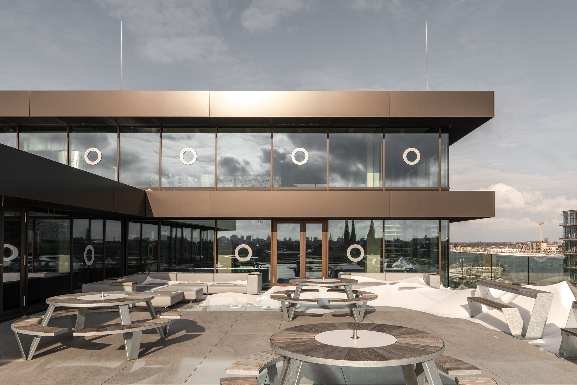
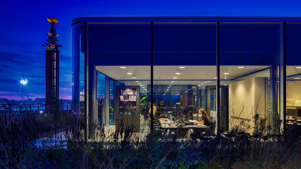
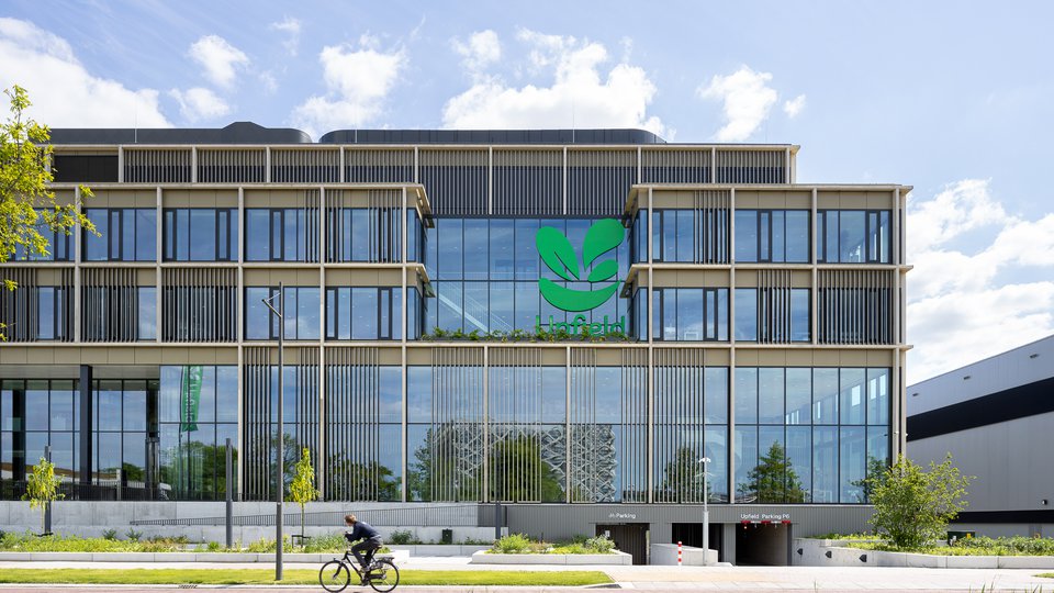
With its move to ‘De Walvis’, the lawfirm Brinkhof chose an iconic building on the Bickerseiland in Amsterdam, constructed in the 1960’s. It was stripped to the bone and completely rebuilt into a contemporary and sustainable multi-tenant building according to a design by KAAN Architects. The Brinkhof office is situated on the top floors and boasts amazing views over the city of Amsterdam and the IJ river. Alongside the workspaces it features a meeting centre, library, restaurant and a roof terrace.
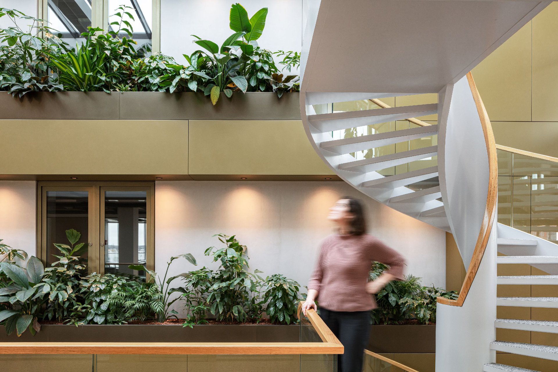
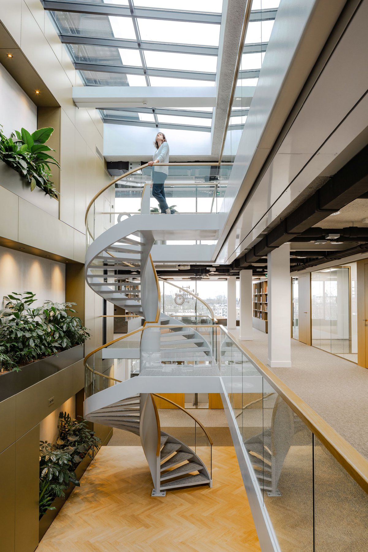
By adding a large rooflight and a void to connect the top 3 floors, daylight enters at the heart of the building. The intervention makes use of the vast building depth. The vertical interconnection of the work-space breaks up the large floor surfaces with a relatively low ceiling height, transforming the complete spatial experience. A spiral staircase is placed against an interior façade-like backdrop; a wall with lush greenery. With this dynamic to complement the building architecture, the culture of the law firm is optimally supported.
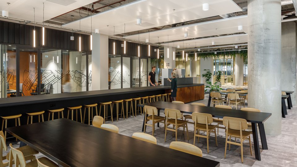
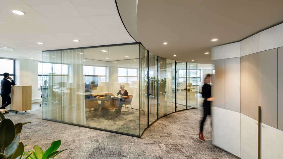
Due to the nature of their work, the firm wanted many closed workspaces and meeting rooms. With largely glazed separations, the sightlines and a transparent spatial character are preserved. Slender wooden doors and doorframes alternate with the glass, forming a self-evident sequence of transparent and closed faces. Corridors are wide and feel like an extension of the private spaces, up to the integrated cupboards where the flooring shifts to a dark colour. The office provides a tranquil, spacious and warm work environment where both concentration and providing mental space are key.
The vertical interconnection of the workspaces transforms the complete spatial experience.
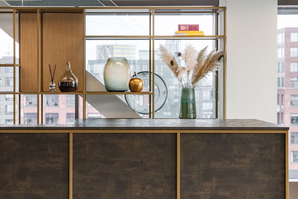
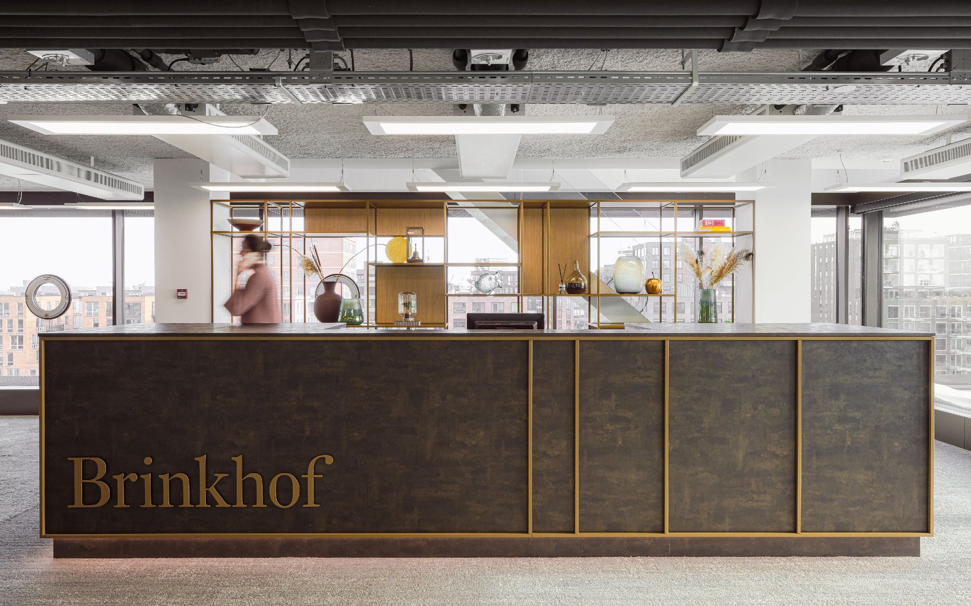
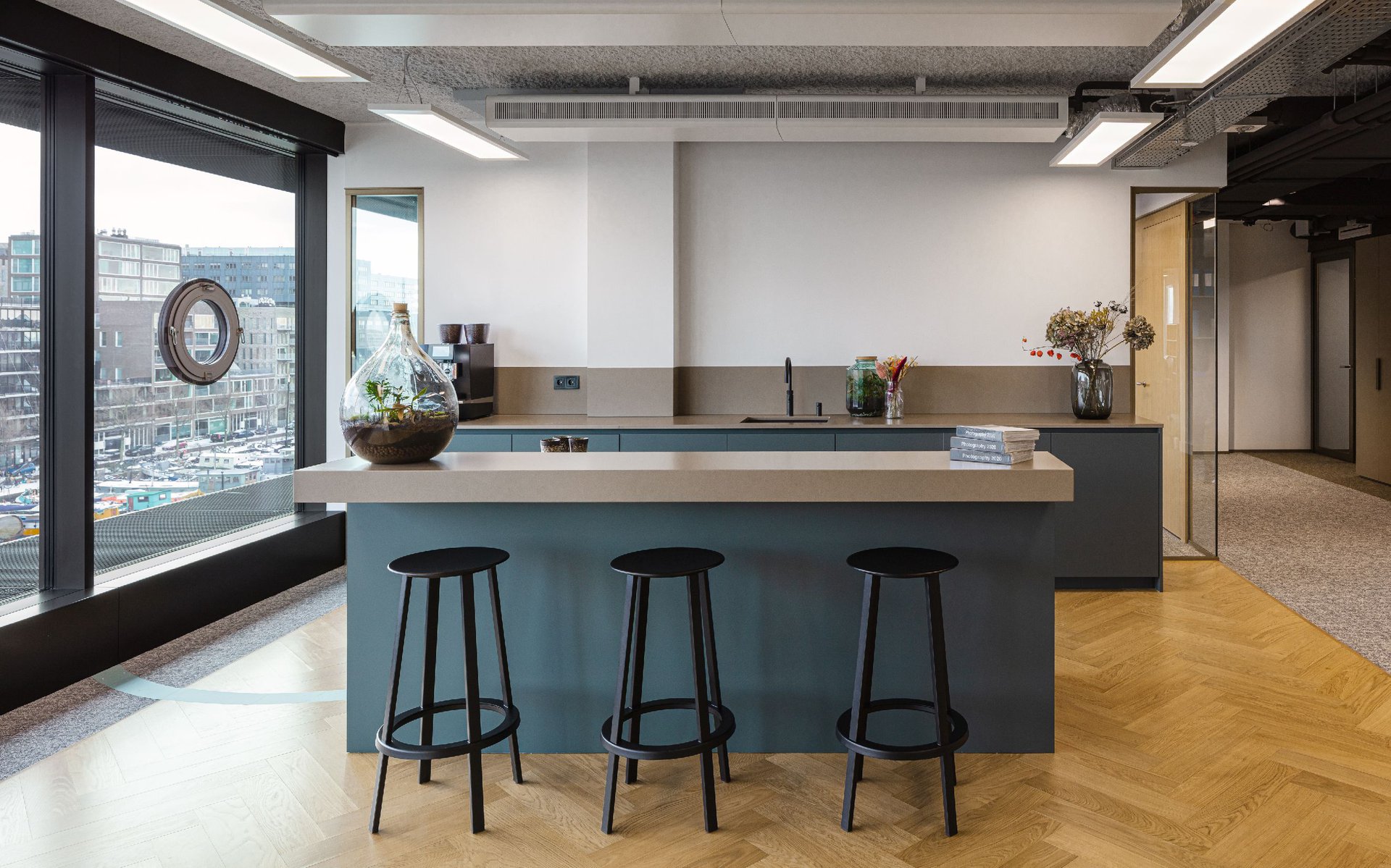
The interior has an outspoken colour scheme with gold-coloured faces, brass frames, shades of brown, blue, beige and natural wood. All are balanced to create a subdued yet refined atmosphere. The exposed ceiling with its accentuated black installations and white lighting fixtures merges with the raw building structure. The clear and rythmic interior design is a warm counterpart to stucture and frame the open space while taking advantage of the views. In combination with abundant greenery, the design provides Brinkhof with a welcoming environment that is strikingly transparent.
Photography: Sebastian van Damme
