| Client | Undisclosed |
| Timeline | April 2019 - January 2020 |
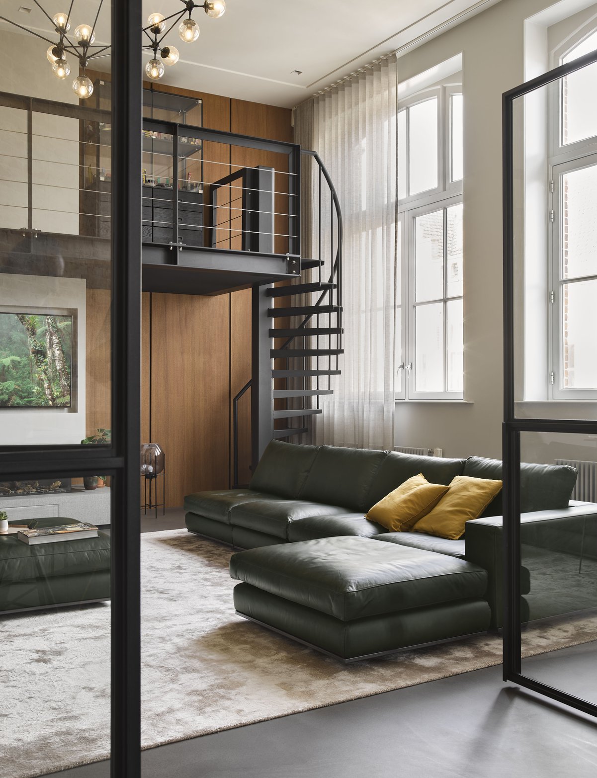
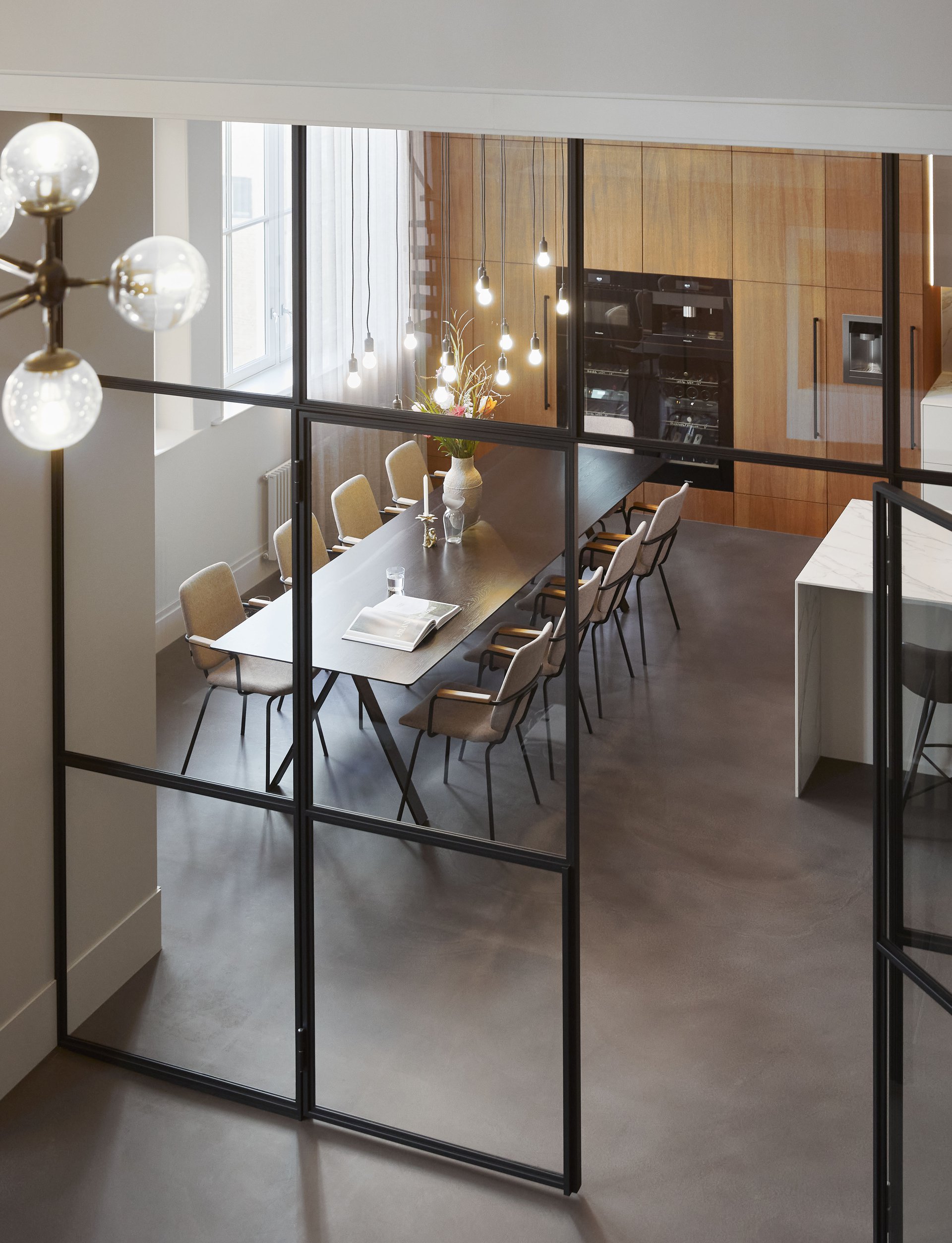
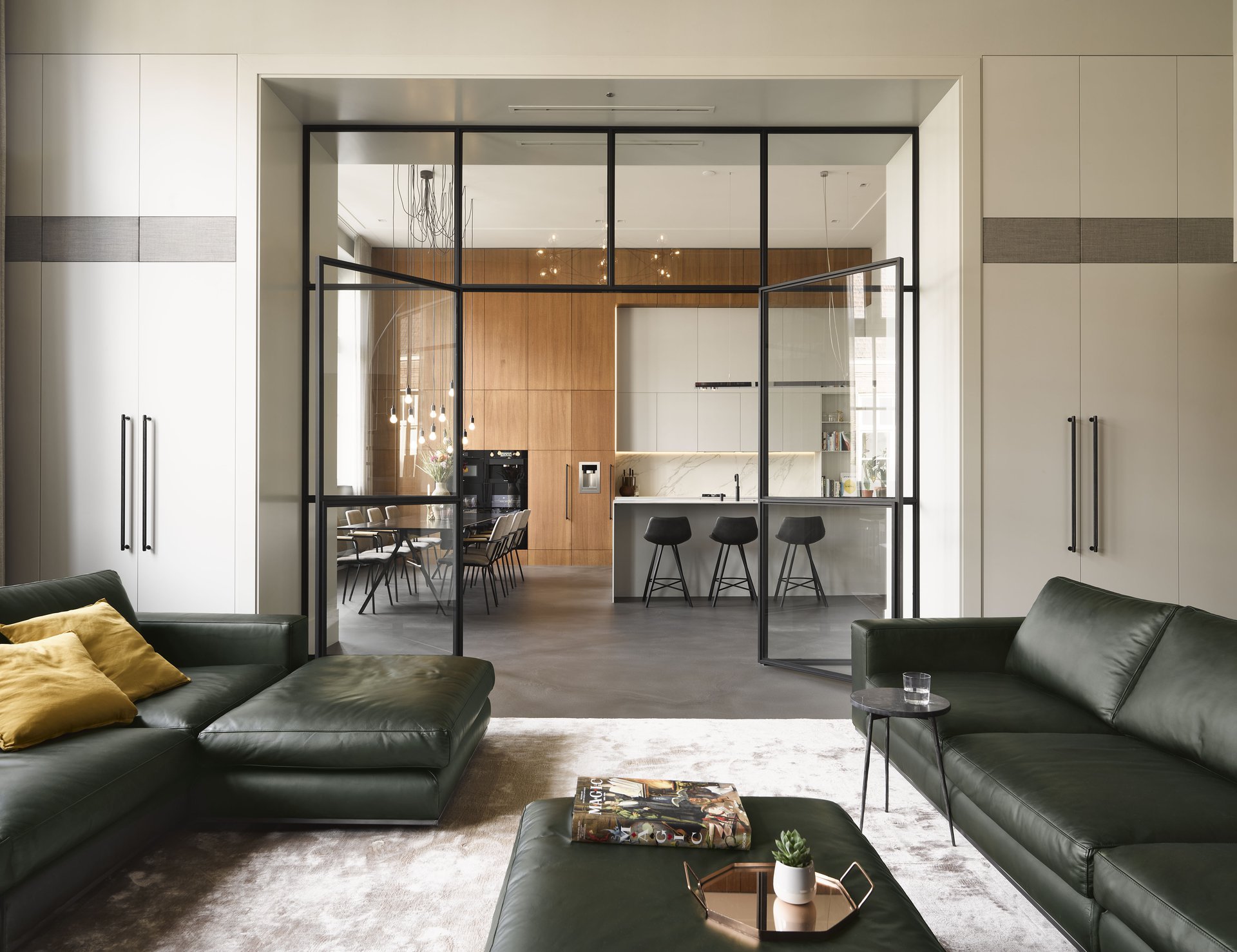
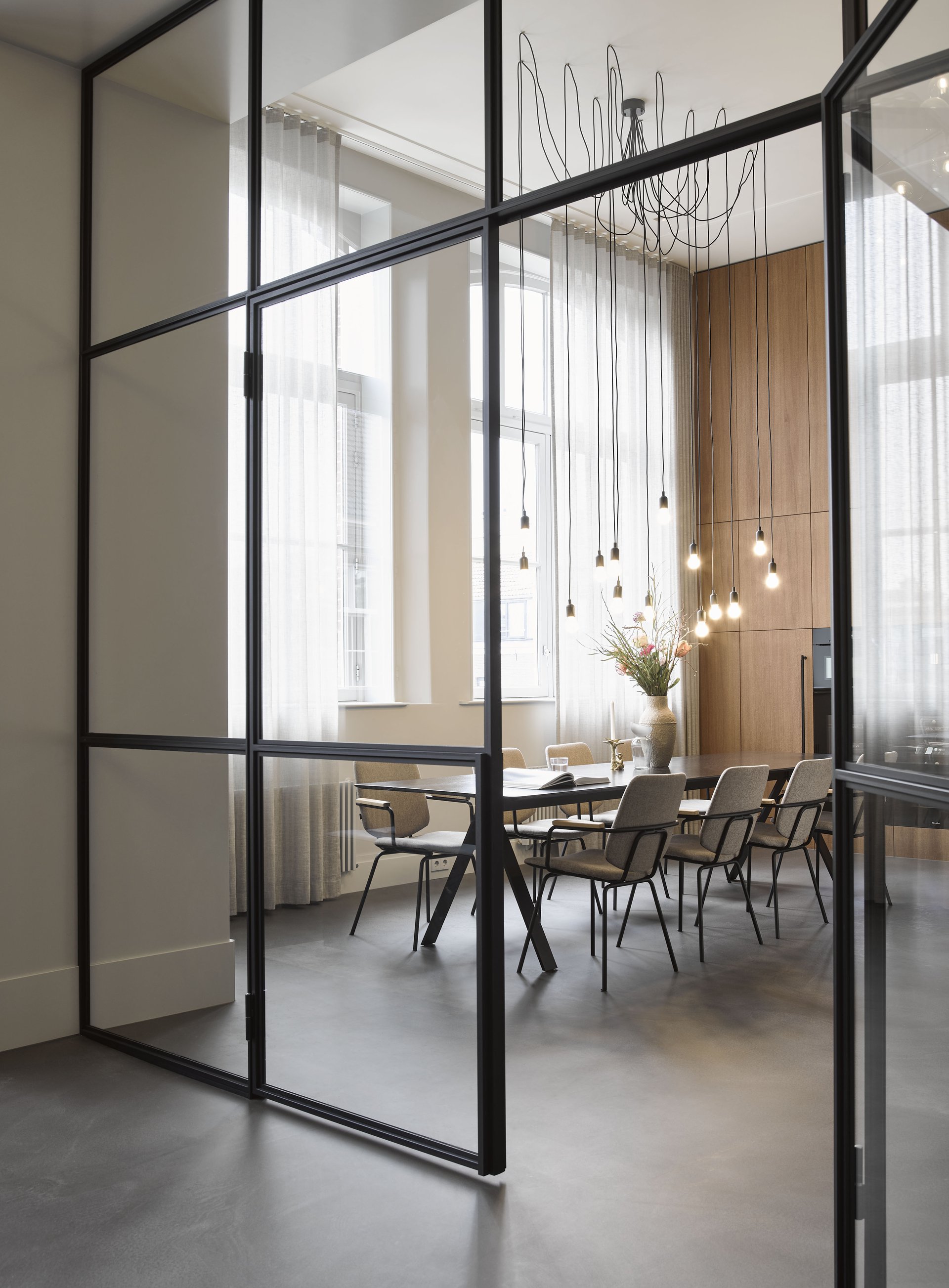
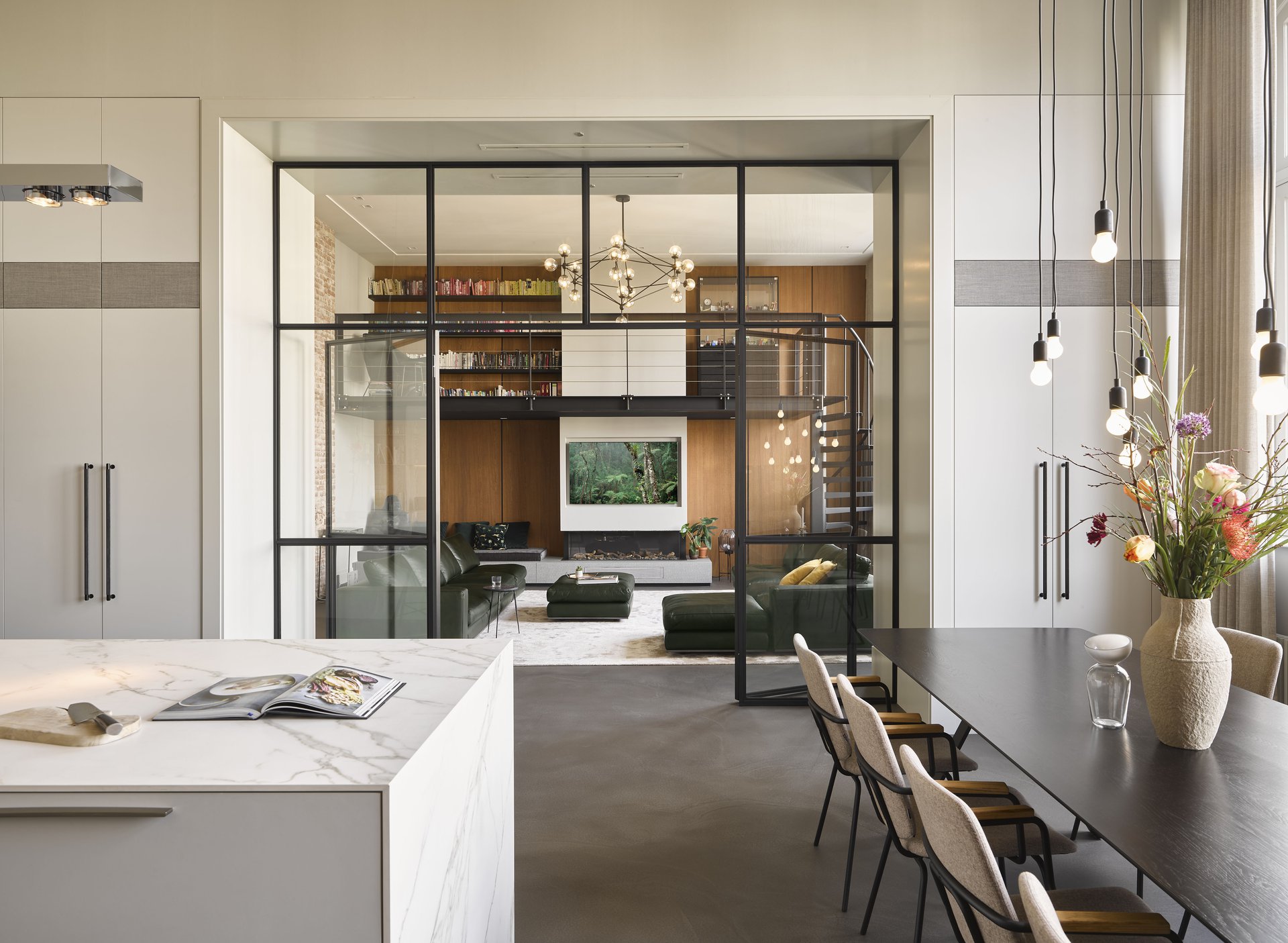
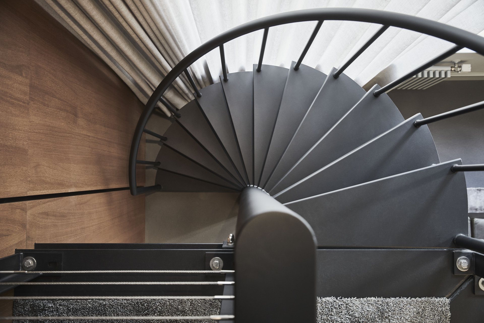
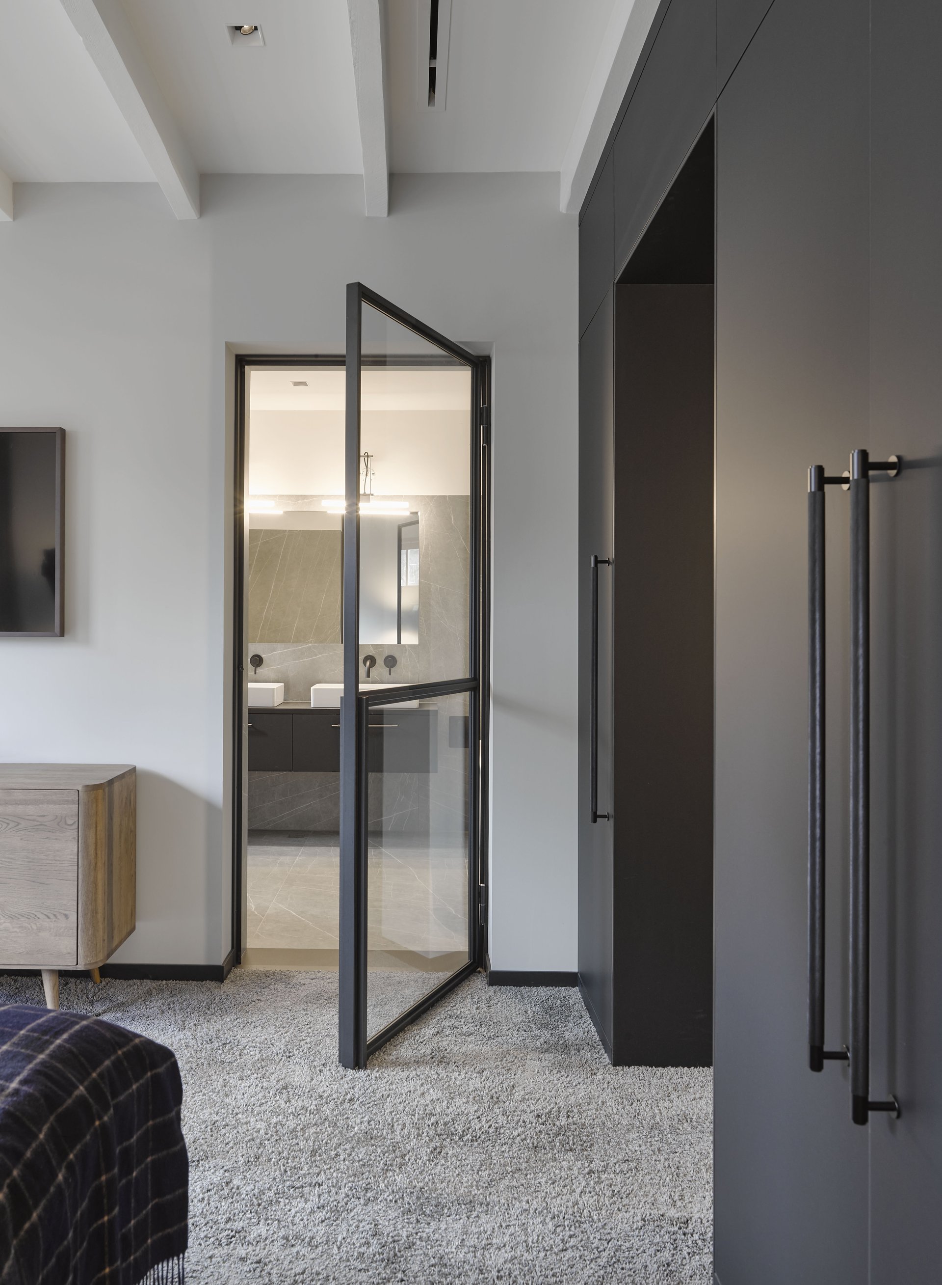
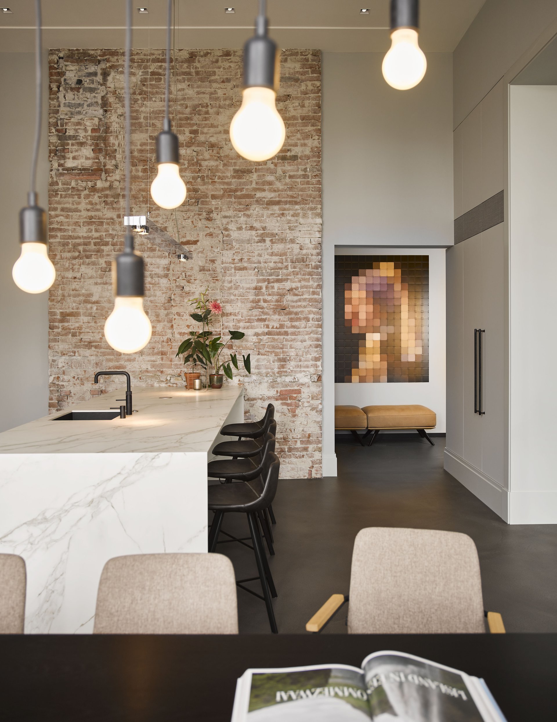
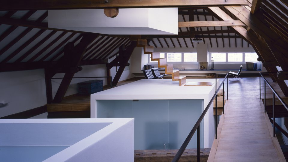
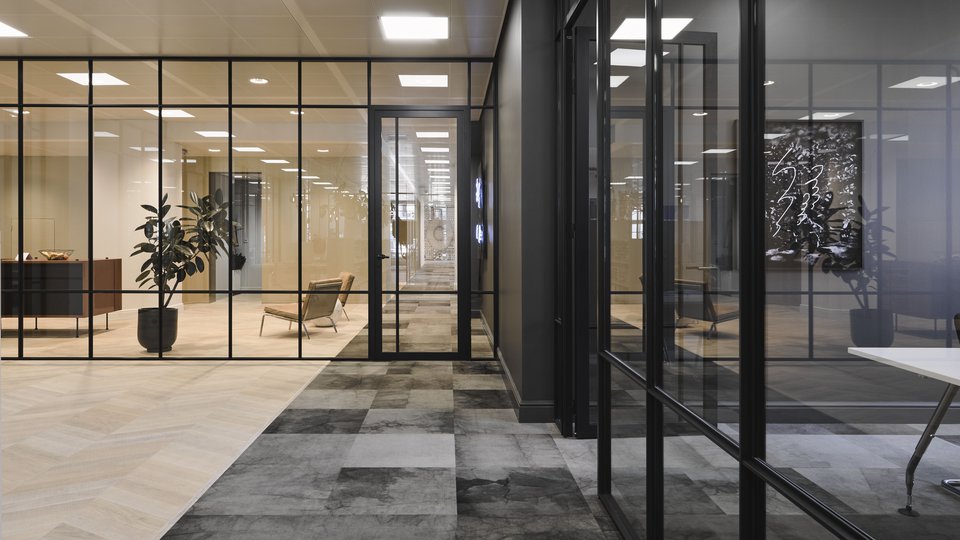
With its high pitched windows to avoid students gazing outside, the space had a rather stringent first appearance. The design turns the original atmosphere into a virtue to emphasize a bold character. The existing brick wall was left in sight, flaws and all. It is contrasted with a pristine white kitchen with clear lines and smooth silestone surface top with subtle natural drawing. Warm wooden panels - its colour and pattern could be derived from a luxury home in the series Mad Man - incorporate cupboards on the one end and provide a refined backdrop for a slender black steel entresol with library on the other. A black steel framed ensuite door, flanked with contemporary ensuite cupboards, connects the former classrooms. It bridges the original spacious characteristics to a self-evident residential atmosphere.
Details are not the details. They make the design. - Charles Eames -
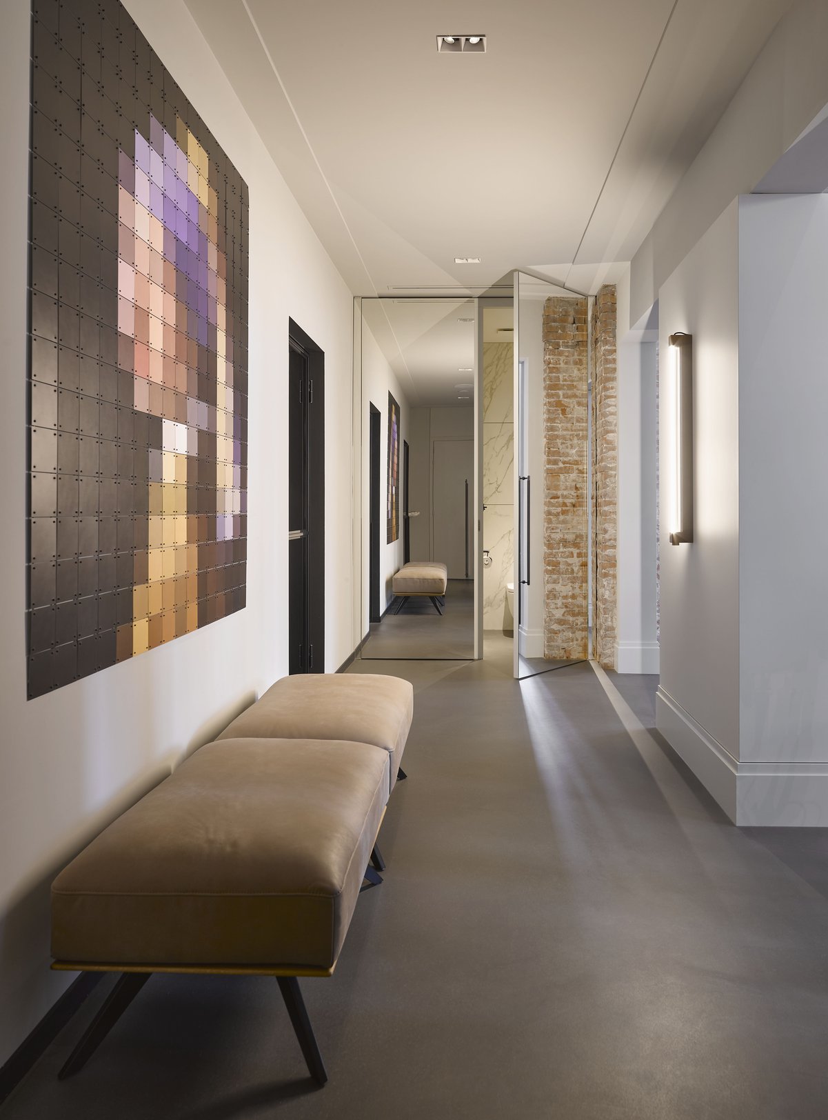
A mirror in the hallway extends sightlines while seamlessly and surprisingly accommodating all of the program. In line with the other design interventions, the mirror hides secret doors. A bedroom, bathroom and study are housed in the former offices with a more intimate atmosphere and wooden ceiling.
Photography: Alexander van Berge.
